- Excel Pivot Tables Tutorial
- Excel Pivot Tables - Home
- Excel Pivot Tables - Overview
- Excel Pivot Tables - Creation
- Excel Pivot Tables - Fields
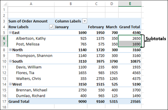
- Excel Pivot Tables - Areas
- Excel Pivot Tables - Exploring Data
- Excel Pivot Tables - Sorting Data
- Excel Pivot Tables - Filtering Data
- Filtering data using Slicers
- Excel Pivot Tables - Nesting
- Excel Pivot Tables - Tools
- Summarizing Values
- Excel Pivot Tables - Updating Data
- Excel Pivot Tables - Reports
- Excel Pivot Tables Useful Resources
- Excel Pivot Tables - Quick Guide
- Excel Pivot Tables - Resources
- Excel Pivot Tables - Discussion
Excel Pivot Tables - Quick Guide
Excel Pivot Tables - Overview
A PivotTable is an extremely powerful tool that you can use to slice and dice data. You can track and analyze hundreds of thousands of data points with a compact table that can be changed dynamically to enable you to find the different perspectives of the data. It is a simple tool to use, yet powerful.
The major features of a PivotTable are as follows −
Creating a PivotTable is extremely simple and fast
Enabling churning of data instantly by simple dragging of fields, sorting and filtering and different calculations on the data.
Arriving at the suitable representation for your data as you gain insights into it.
Ability to create reports on the fly.
Producing multiple reports from the same PivotTable in a matter of seconds.
Providing interactive reports to synchronize with the audience.
In this tutorial, you will understand these PivotTable features in detail along with examples. By the time you complete this tutorial, you will have sufficient knowledge on PivotTable features that can get you started with exploring, analyzing, and reporting data based on the requirements.
Creating a PivotTable
You can create a PivotTable from a range of data or an Excel table. You can start with an empty PivotTable to fill in the details, if you are aware of what you are looking for. You can also make use of Excel Recommended PivotTables that can give you heads up on the PivotTable layouts that are best suited for summarizing your data.
You will learn how to create a PivotTable from a data range or Excel table in the Chapter - Creating a PivotTable from a Table or Range.
Excel gives you a more powerful way of creating a PivotTable from multiple tables, different data sources, and external data sources. It is named as PowerPivot that works on its database known as Data Model. You will learn these Excel power tools in other tutorials in this Tutorials Library.
You need to first know about the normal PivotTable as explained in this tutorial, before you venture into the power tools.
PivotTable Layout - Fields and Areas
The PivotTable layout simply depends on what fields you have selected for the report and how you have arranged them in Areas. The selection and arrangement can be done by just dragging the fields. As you drag the fields, the PivotTable layout keeps the changing and it happens in a matter of seconds.
You will learn about PivotTable Fields and Areas in the Chapters – PivotTable Fields and PivotTable Areas.
Exploring Data with PivotTable
The primary goal of using a PivotTable normally is to explore the data to extract significant and required information. You have several options to do this that include Sorting, Filtering, Nesting, Collapsing and Expanding, Grouping and Ungrouping, etc.
You will have an overview of these options in the Chapter - Exploring Data with PivotTable.
Summarizing Values
Once you collate the data required by you by the different exploration techniques, the next step that you would like to take is to summarize the data. Excel provides you with a variety of calculation types that you can apply based on suitability and requirement. You can also switch across different calculation types and view the results in a matter of seconds.
You will learn how to apply the calculation types on a PivotTable in the Chapter - Summarizing Values by Different Calculation Types.
Updating a PivotTable
Once you have explored the data and summarized it, you need not repeat the exercise if and when the source data gets updated. You can refresh the PivotTable so that it reflects the changes in the source data.
You will learn the various ways of refreshing data in the Chapter – Updating a PivotTable.
PivotTable Reports
After exploring and summarizing the data with a PivotTable, you would be presenting it as a report. PivotTable reports are interactive in nature, with the specialty that even a person not familiar with Excel can use them intuitively. Because of their inherent dynamic nature, they will enable you to change the perspective quickly of the report to show the required level of detail or to focus on the specific items in which the audience expresses interest.
Further, you can structure a PivotTable report for standalone presentation or as an integral part of a broad report as the case may be. You will learn the several of reporting with PivotTables in the Chapter – PivotTable Reports.
Excel Pivot Tables - Creation
You can create a PivotTable either from a range of data or from an Excel table. In both the cases, the first row of the data should contain the headers for the columns.
If you are sure of the fields to be included in the PivotTable and the layout you want to have, you can start with an empty PivotTable and construct the PivotTable.
In case you are not sure which PivotTable layout is best suitable for your data, you can make use of Recommended PivotTables command of Excel to view the PivotTables customized to your data and choose the one you like.
Creating a PivotTable from a Data Range
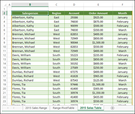
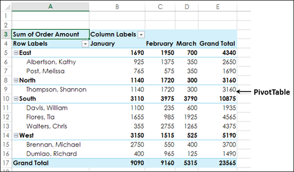
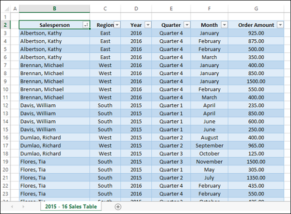
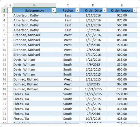
Consider the following data range that contains the sales data for each Salesperson, in each Region and in the months of January, February and March −
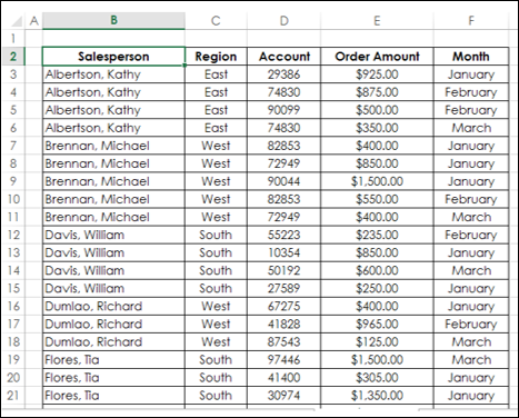
To create a PivotTable from this data range, do the following −
Ensure that the first row has headers. You need headers because they will be the field names in your PivotTable.
Name the data range as SalesData_Range.
Click on the data range – SalesData_Range.
Click the INSERT tab on the Ribbon.
Click PivotTable in the Tables group. The Create PivotTable dialog box appears.
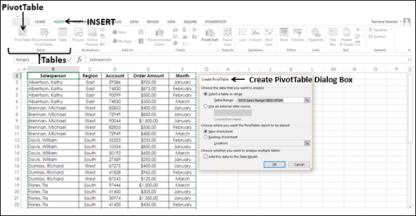
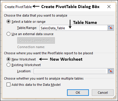
In Create PivotTable dialog box, under Choose the data that you want to analyze, you can either select a Table or Range from the current workbook or use an external data source.
As you are creating a PivotTable from a data range, select the following from the dialog box −
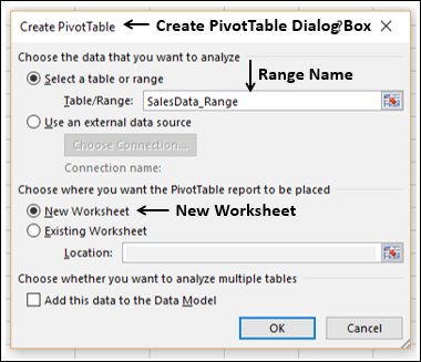
Select Select a table or range.
In the Table/Range box, type the range name – SalesData_Range.
Select New Worksheet under Choose where you want the PivotTable report to be placed and click OK.
You can choose to analyze multiple tables, by adding this data range to Data Model. You can learn how to analyze multiple tables, use of Data Model and how to use an external data source to create a PivotTable in the tutorial Excel PowerPivot.
A new worksheet is inserted into your workbook. The new worksheet contains an empty PivotTable. Name the worksheet – Range-PivotTable.
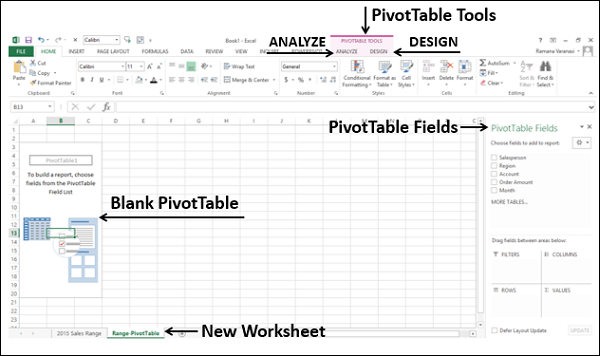
As you can observe, the PivotTable Fields list appears on the right side of the worksheet, containing the header names of the columns in the data range. Further, on the Ribbon, PivotTable Tools – ANALYZE and DESIGN appear.
Adding Fields to the PivotTable
You will understand in detail about PivotTable Fields and Areas in the later chapters in this tutorial. For now, observe the steps to add fields to the PivotTable.
Suppose you want to summarize the order amount salesperson-wise for the months January, February, and March. You can do it in few simple steps as follows −
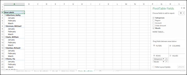
Click on the field Salesperson in the PivotTable Fields list and drag it to the ROWS area.
Click the field Month in the PivotTable Fields list and drag that also to ROWS area.
Click on Order Amount and drag it to ∑ VALUES area.
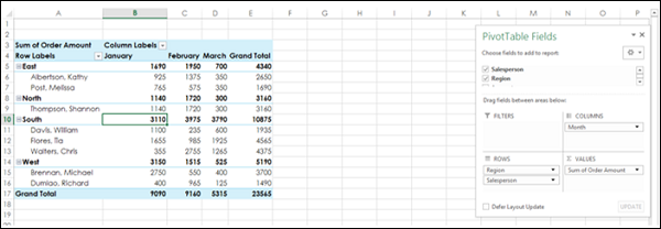
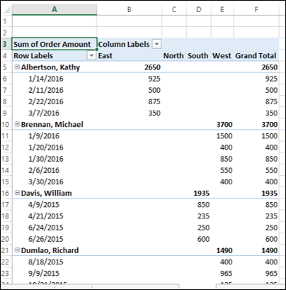
Your first PivotTable is ready as shown below
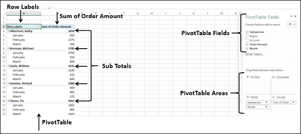
Observe that two columns appear in the PivotTable, one containing the Row Labels that you selected, i.e. Salesperson and Month and a second one containing Sum of Order Amount. In addition to Sum of Order Amount month wise for each Salesperson, you will also get subtotals representing the total sales by that person. If you scroll down the worksheet, you will find the last row as Grand Total representing total sales.
You will learn more about producing PivotTables as per the need as you progress through this tutorial.
Creating a PivotTable from a Table
Consider the following Excel table that contains the same sales data as in the previous section −
An Excel table will inherently have a name and the columns will have headers, which is a requirement to create a PivotTable. Suppose the table name is SalesData_Table.
To create a PivotTable from this Excel table, do the following −
Click on the table – SalesData_Table.
Click the INSERT tab on the Ribbon.
Click PivotTable in the Tables group. The Create PivotTable dialog box appears.
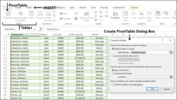
Click Select a table or range.
In the Table/Range box, type the table name – SalesData_Table.
Select New Worksheet under Choose where you want the PivotTable report to be placed. Click OK.
A new worksheet is inserted into your workbook. The new worksheet contains an empty PivotTable. Name the worksheet – Table-PivotTable. The worksheet – Table-PivotTable looks similar to the one you have got in the data range case in the earlier section.
You can add fields to the PivotTable as you have seen in the section – Adding Fields to the PivotTable, earlier in this chapter.
Creating a PivotTable with Recommended PivotTables
In case you are not familiar with Excel PivotTables or if you do not know which fields would result in a meaningful report, you can use the Recommended PivotTables command in Excel. Recommended PivotTables gives you all the possible reports with your data along with the associated layout. In other words, the options displayed will be the PivotTables that are customized to your data.
To create a PivotTable from the Excel table SalesData-Table using Recommended PivotTables, proceed as follows −
Click on the table SalesData-Table.
Click the INSERT tab.
Click Recommended PivotTables in the Tables group. The Recommended PivotTables Dialog Box appears.
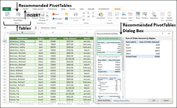
In the Recommended PivotTables dialog box, the possible customized PivotTables that suit your data will be displayed.
Click on each of the PivotTable options to see the preview on the right side.
Click on the PivotTable - Sum of Order Amount by Salesperson and Month and click OK.
You will be get the preview on the right side.
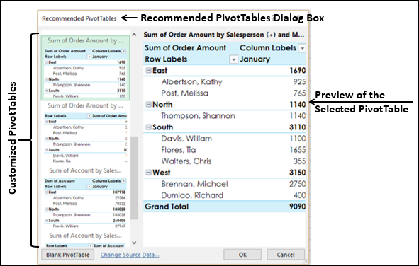
The selected PivotTable appears on a new worksheet in your workbook.
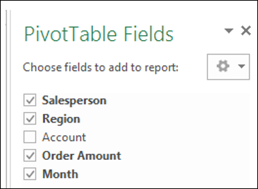
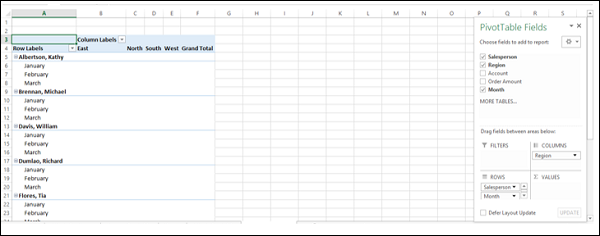
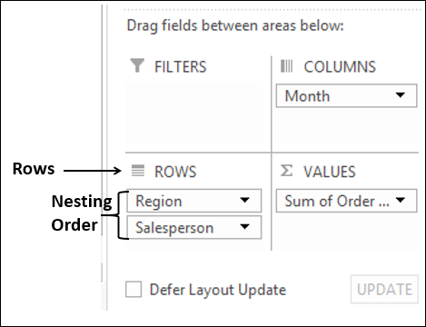
You can see that the PivotTable Fields - Salesperson, Region, Order Amount and Month got selected. Of these, Region and Salesperson are in ROWS area, Month is in COLUMNS area, and Sum of Order Amount is in ∑ VALUES area.
The PivotTable summarized the data Region-wise, Salesperson-wise and Month-wise. The subtotals are displayed for each Region, each Salesperson, and each Month.
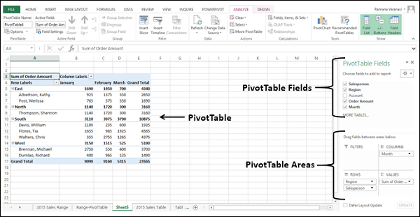
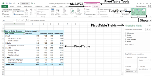
Excel Pivot Tables - Fields
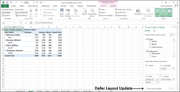
PivotTable Fields is a Task Pane associated with a PivotTable. The PivotTable Fields Task Pane comprises of Fields and Areas. By default, the Task Pane appears at the right side of the window with Fields displayed above Areas.
Fields represent the columns in your data – range or Excel table, and will have check boxes. The selected fields are displayed in the report. Areas represent the layout of the report and the calculations included in the report.
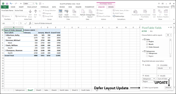
At the bottom of the Task Pane, you will find an option – Defer Layout Update with an UPDATE button next to it.
By default, this is not selected and whatever changes you make in the selection of fields or in the layout options are reflected in the PivotTable instantly.
If you select this, the changes in your selections are not updated until you click on the UPDATE button.
In this chapter, you will understand the details about Fields. In the next chapter, you will understand the details about Areas.
PivotTable Fields Task Pane
You can find the PivotTable Fields Task Pane on the worksheet where you have a PivotTable. To view the PivotTable Fields Task Pane, click the PivotTable. In case the PivotTable Fields Task Pane is not displayed, check the Ribbon for the following −
- Click the ANALYZE tab under PIVOTTABLE TOOLS on the Ribbon.
- Check if Fields List is selected (i.e. highlighted) in the Show group.
- If Fields List is not selected, then click it.
The PivotTable Fields Task Pane will be displayed on the right side of the window, with the title – PivotTable Fields.
Moving PivotTable Fields Task Pane
On the right of the title PivotTable Fields of the PivotTable Task Pane, you will find the button ![]() . This represents Task Pane Options. Click the button
. This represents Task Pane Options. Click the button ![]() . The Task Pane Options- Move, Size and Close appear in the dropdown list.
. The Task Pane Options- Move, Size and Close appear in the dropdown list.
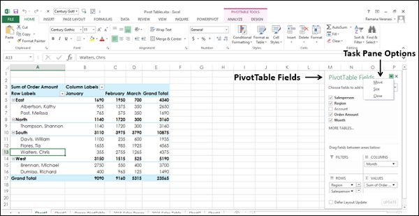
You can move the PivotTables Task Pane to anywhere you want in the window as follows −
Click Move in the dropdown list. The
 button appears on the Task Pane.
Click the
icon and drag the pane to a position where you want to place it. You can place the Task Pane next to the PivotTable as given below.
You can place the Task Pane on the left side of the window as given below.
Resizing PivotTable Fields Task Pane
You can resize the PivotTables Task Pane – i.e. increase / decrease the Task Pane length and/or width as follows −
Click on Task Pane Options −
 that is on the right side of the title - PivotTable Fields.
Click on Size in the dropdown list.
Use the symbol ⇔ to increase / decrease the width of the Task Pane.
Use the symbol ⇕ to increase / decrease the width of the Task Pane.
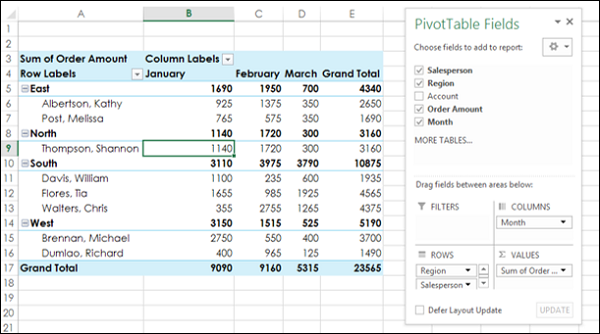
In the ∑ VALUES area, to make Sum of Order Amount visible completely, you can resize the Task Pane as given below.
PivotTable Fields
The PivotTable Fields list comprises of all the tables that are associated with your workbook and the corresponding fields. It is by selecting the fields in the PivotTable fields list, you will create the PivotTable.
The tables and the corresponding fields with check boxes, reflect your PivotTable data. As you can check / uncheck the fields randomly, you can quickly change the PivotTable, highlighting the summarized data that you want to report or present.
As you can observe, if there is only one table, the table name will not be displayed in the PivotTable Fields list. Only the fields will be displayed with check boxes.
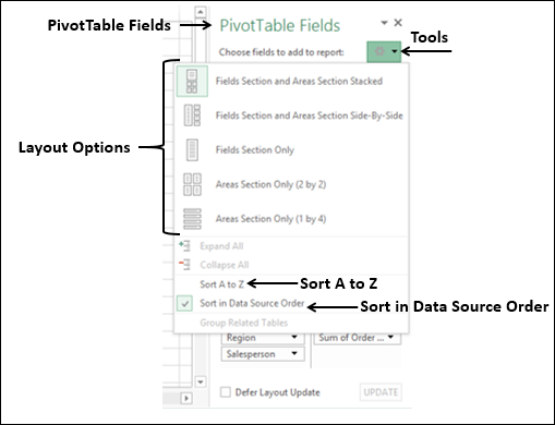
Above the fields list, you will find the action Choose fields to add to report. To the right, you will find the button −  that represents Tools.
- Click on the Tools button.
In the dropdown list, you will find the following −
Five different layout options for Fields and Areas.
Two options for Sort order of the fields in the Fields list −
Sort A to Z.
Sort in Data Source Order.
As you can observe in the above Fields list, the Sort order is by default – i.e. in Data Source Order. This means, it is the order in which the columns in your data table appear.
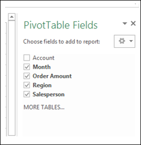
Normally, you can retain the default order. However, at times, you might encounter many fields in a table and might not be acquainted with them. In such a case, you can sort the fields in alphabetical order by clicking on – Sort A to Z in the dropdown list of Tools. Then, the PivotTable Fields list looks as follows −
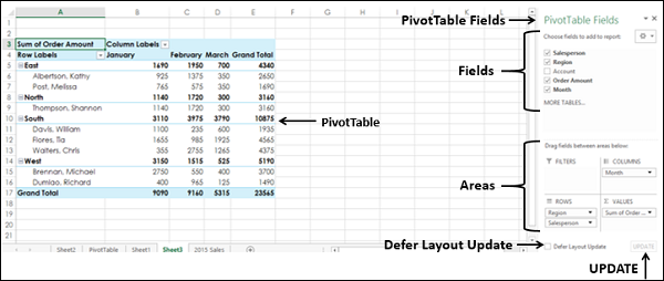
Excel Pivot Tables - Areas
PivotTable areas are a part of PivotTable Fields Task Pane. By arranging the selected fields in the areas, you can arrive at different PivotTable layouts. As you can simply drag the fields across areas, you can quickly switch across the different layouts, summarizing the data, in a way you want.
You have already learnt about PivotTable Fields Task Pane in the earlier chapter on PivotTable Fields in this tutorial. In this chapter, you will learn about the PivotTable areas.
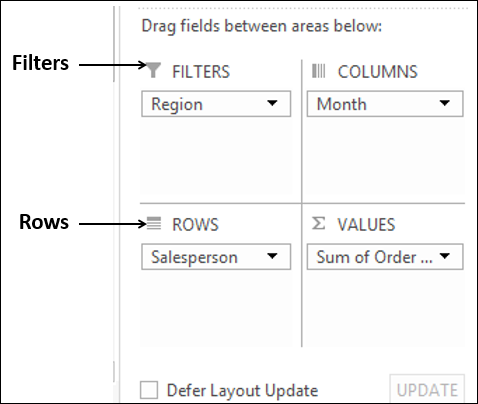
There are four PivotTable areas available −
- ROWS.
- COLUMNS.
- FILTERS.
- ∑ VALUES (Read as Summarizing Values).
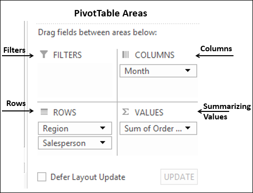
The message - Drag fields between areas below appears above the areas.
With PivotTable Areas, you can choose −
- What fields to display as rows (ROWS area).
- What fields to display as columns (COLUMNS area).
- How to summarize your data (∑ VALUES area).
- Filters for any of the fields (FILTERS area).
You can just drag the fields across these areas and observe how the PivotTable Layout changes.
ROWS
If you select the fields in the PivotTable Fields lists by just checking the boxes, all the nonnumeric fields will automatically be added to the ROWS area, in the order you select.
You can optionally, drag a field to the ROWS area. The fields that are put in ROWS area appear as rows in the PivotTable, with the Row Labels being the values of the selected fields.
For example, consider the Sales data table.
- Drag the field Salesperson to ROWS area.
- Drag the field Month to ROWS area.
Your PivotTable appears with one column containing the Row Labels – Salesperson and Month and a last row as Grand Total, as given below.
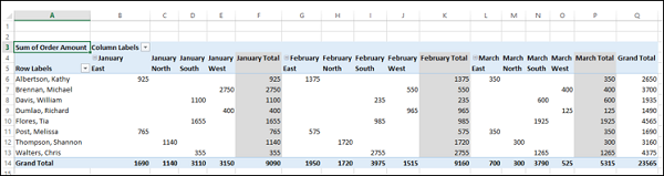
COLUMNS
You can drag fields to the COLUMNS area.
The fields that are put in COLUMNS area appear as columns in the PivotTable, with the Column Labels being the values of the selected fields.
Drag the field Region to COLUMNS area. Your PivotTable appears with the first column containing the Row Labels – Salesperson and Month the next four columns containing the Column Labels – Region and a last column Grand Total as given below.
Drag the field Month from ROWS to COLUMNS.
Drag the field Region from COLUMNS to ROWS. Your PivotTable layout changes as given below.
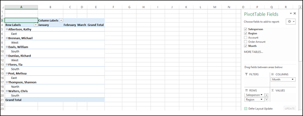
You can see that there are only five columns now – the first column with Row Labels, three columns with Column Labels and a last column with Grand Total.
The number of Rows and Columns is based on the number of values you have in those fields.
∑ VALUES
The primary use of a PivotTable is to summarize values. Hence, by placing the fields by which you want to summarize the data in ∑ VALUES area, you arrive at the summary table.
Drag the field Order Amount to ∑ VALUES.
Drag the field Region to above the field Salesperson in ROWS area. This step is to change the nesting order. You will learn nesting in the chapter – Nesting in the PivotTable in this tutorial.
As you can observe, the data is summarized region-wise, salesperson-wise and monthwise. You have subtotals for each region, month wise. You also have grand totals month wise in the Grand Total row grand totals region wise in the Grand Total column.
FILTERS
The Filters area is to place filters in PivotTable. Suppose you want to display results separately for the selected regions only.
Drag the field Region from ROWS area to FILTERS area. The filter Region will be placed above the PivotTable. In case you do not have empty rows above the PivotTable, the PivotTable is pushed down inserting rows above the PivotTable for the filter.
As you can observe, (ALL) appears in the filter by default, and the PivotTable displays data for all the values of the Region.
- Click on the arrow to the right of filter.
- Check the box – Select Multiple Items.
Check boxes will appear for all the options in the dropdown list. By default, all the boxes are checked.
- Check the boxes – North and South.
- Clear the other boxes. Click OK.
The PivotTable gets changed to reflect the filtered data.
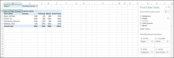
You can observe that the filter displays (Multiple Items). Therefore, when someone is looking at the PivotTable, it is not immediately obvious of what values are filtered.
Excel provides you another tool called Slicers to handle filtering more efficiently. You will understand Filtering Data in a PivotTable in detail in a later chapter in this tutorial.
Excel Pivot Tables - Exploring Data
Excel PivotTable allows you to explore and extract significant data from an Excel table or a range of data. There are several ways of doing this and you can choose the ones that are best suited to your data. Further, while you are exploring the data, you can view the different combinations instantly as you change your choices to pick the data values.
You can do the following with a PivotTable −
- Sort the data.
- Filter the data.
- Nest the PivotTable fields.
- Expand and Collapse the fields.
- Group and ungroup field values.
Sorting and Filtering Data
You can sort the data in a PivotTable in ascending or descending order of the field values. You can also sort by subtotals from largest to smallest or smallest to largest values. You can also set sort options. You will learn these in detail in the chapter – Sorting Data in a PivotTable in this tutorial.
You can filter the data in a PivotTable to focus on some specific data. You have several filtering options in PivotTable that you will learn in the chapter – Filtering Data in a PivotTable in this tutorial. You can use Slicers for filtering, which you will learn in the chapter – Filtering using Slicers in this tutorial.
Nesting, Expanding and Collapsing Fields
You can nest fields in a PivotTable to show a hierarchy, if relevant to your data. You will learn this in the chapter - Nesting in a PivotTable in this tutorial.
When you have nested fields in your PivotTable, you can expand and collapse the values of those fields. You will learn these in the Chapter – Exploring Data with PivotTable Tools in this tutorial.
Grouping and Ungrouping Field Values
You can group and ungroup specific values of a field in a PivotTable. You will learn this in the Chapter – Exploring Data with PivotTable Tools in this tutorial.
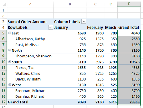
Excel Pivot Tables - Sorting Data
You can sort the data in a PivotTable so that it will be easy for you to find the items you want to analyze. You can sort the data from lowest to highest values or highest to lowest values or in any other custom order that you choose.
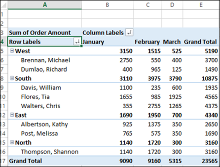
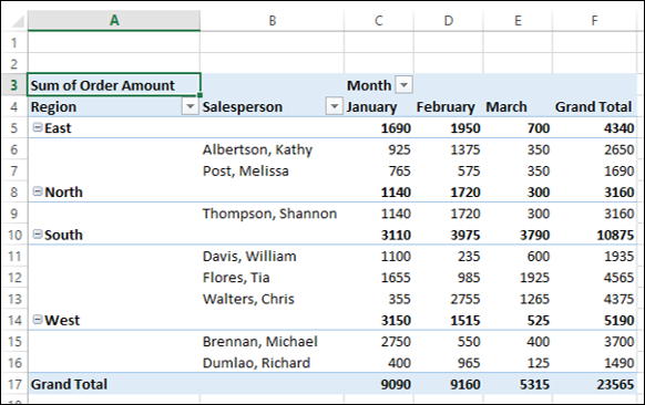
Consider the following PivotTable wherein you have the summarized sales data region-wise, salesperson-wise and month-wise.

Sorting on Fields
You can sort the data in the above PivotTable on Fields that are in Rows or Columns – Region, Salesperson and Month.
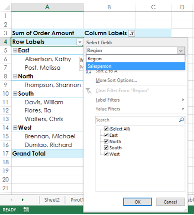
To sort the PivotTable with the field Salesperson, proceed as follows −
Click the arrow
in the Row Labels.Select Salesperson in the Select Field box from the dropdown list.
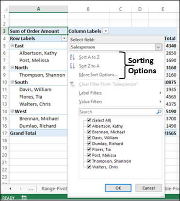
The following sorting options are displayed −
- Sort A to Z.
- Sort Z to A.
- More Sort Options.
Further, the Salesperson field is sorted in ascending order, by default. Click Sort Z to A. The Salesperson field will be sorted in descending order.
In the same way, you can sort the field in column – Month, by clicking on the arrow ![]() in the column labels.
in the column labels.
Sorting on Subtotals
Suppose you want to sort the PivotTable based on total order amount – highest to lowest in every Region. That is, you want to sort the PivotTable on subtotals.
You can see that there is no arrow ![]() for subtotals. You can still sort the PivotTable on subtotals as follows −
for subtotals. You can still sort the PivotTable on subtotals as follows −
Right-click on the subtotal of any of the Salespersons in the Grand Total column.
Select Sort from the dropdown list.
Another dropdown list appears with the sorting options – Sort Smallest to Largest, Sort Largest to Smallest and More Sort Options. Select Sort Largest to Smallest.
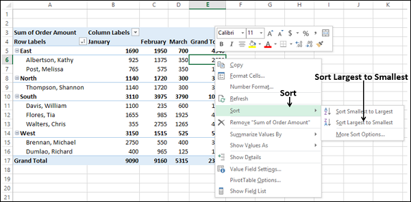
The subtotals in the Grand Total column are sorted from highest to lowest values, in every region.
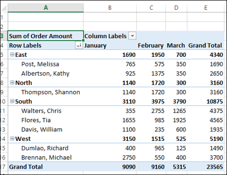
Likewise, if you want to sort the PivotTable on subtotals region wise, do the following −
Right click on the subtotal of any of the regions in the Grand Total column.
Click Sort in the dropdown list.
Click Sort Largest to Smallest in the second dropdown list. The PivotTable will get sorted on subtotals region-wise.
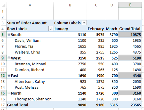
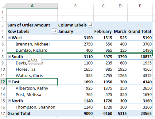
As you can observe, South has the highest order amount while North has the lowest.
You can also sort the PivotTable based on the total amount month wise as follows −
- Right click on any of the Subtotals in the Grand Total row.
- Select Sort from the dropdown list.
- Select Sort Largest to Smallest from the second dropdown list.
The PivotTable will be sorted on total amount month wise.
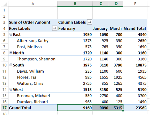
You can observe that February has highest order amount while March has the lowest.
More Sort Options
Suppose you want to sort the PivotTable on total amount region wise in the month of January.
Click on the arrow
in Row Labels.Select More Sort Options from the dropdown list. The Sort (Region) dialog box appears.
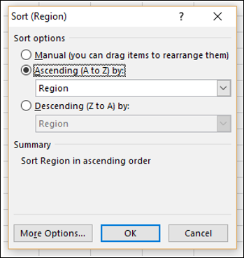
As you can observe, under Summary, the current Sort order is given as Sort Region in ascending order. Ascending (A to Z) by is selected under Sort Options. In the box below that, Region is displayed.
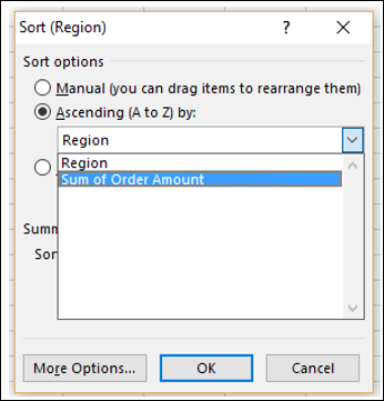
- Click the box containing Region.
- Click Sum of Order Amount.
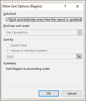
Click the More Options button. The More Sort Options (Region) dialog box appears.
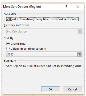
As you can observe, under Sort By, Grand Total is selected. Under Summary, the current sort order is given as Sort Region by Sum of Order Amount in ascending order.
Click Values in selected column: under Sort By.
In the box below that, type B5.
As you can observe, under Summary, the current sort order is given as follows −
Sort Region by Sum of Order Amount in ascending order using values in this column: January. Click OK.
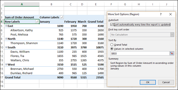
The Sort (Region) dialog box appears. Select Descending (Z to A) by: under Sort Options.
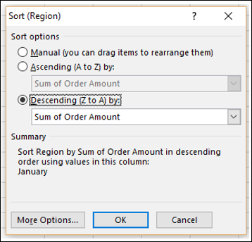
Under Summary, the current sort order is given as follows −
Sort Region by Sum of Order Amount in descending order, using values in this column: January. Click OK. The PivotTable will be sorted on region, using values in January.
As you can observe, in the month of January, West has the highest order amount while North has the lowest.
Sorting Data Manually
In the PivotTable, the data is sorted automatically by the sorting option that you have chosen. This is termed as AutoSort.
Place the cursor on the arrow ![]() in Row Labels or Column Labels.
in Row Labels or Column Labels.
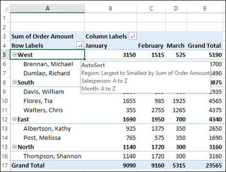
AutoSort appears, showing the current sort order for each of the fields in the PivotTable. Now, suppose you want to sort the field Region in the order – East, West, North and South. You can do this manually, as follows −
Click the arrow
in Row Labels.Select Region in the Select Field box from the dropdown list.
Click More Sort Options. The Sort (Region) dialog box appears.
Select Manual (you can drag items to rearrange them).
Click OK.
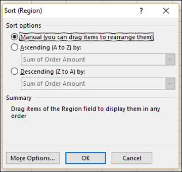
Under Summary, the current sort order is given as Drag items of the Region field to display them in any order.
Click on the East and drag it to the top. While you are dragging East, a horizontal green bar appears across the entire row moves.
Repeat the dragging with other items of the Region field until you get the required arrangement.
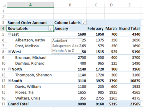
You can observe the following −
The items of the nested field – Salesperson also move along with the corresponding Region field item. Further, the values in the other columns also moved accordingly.
If you place the cursor on the arrow
in Row Labels or Column Labels, AutoSort appears showing the current sort order of the fields Salesperson and Month only. As you have sorted Region field manually, it will not show up in AutoSort.
Note − You cannot use this manual dragging of items of the field that is in ∑ VALUES area of the PivotTable Fields list. Therefore, you cannot drag the Sum of Order Amount values in this PivotTable.
Setting Sort Options
In the previous section, you have learnt how to set the sorting option for a field to manual. You have some more sort options that you can set as follows −
Click the arrow
in Row Labels.Select Region in the Select Field box.
Click More Sort Options. The Sort (Region) dialog box appears.
Click the More Options button.
More Sort Options (Region) dialog box appears. You can set more sort options in this dialog box.
Under AutoSort, you can check or uncheck the box - Sort automatically every time the report is updated, to allow or stop automatic sorting whenever the PivotTable data is updated.
- Uncheck the box – Sort automatically every time the report is updated.
Now, First key sort order option becomes available. You can use this option to select the custom order you want to use.
- Click the box under First key sort order.
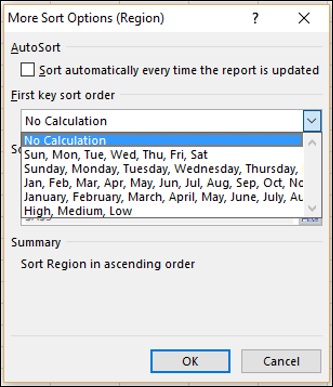
As you can observe, day-of-the-week and month-of-the year custom lists are provided in the dropdown list. You can use any of these, or you can use your own custom list such as High, Medium, Low or the sizes list S, M, L, XL that are not in alphabetical order.
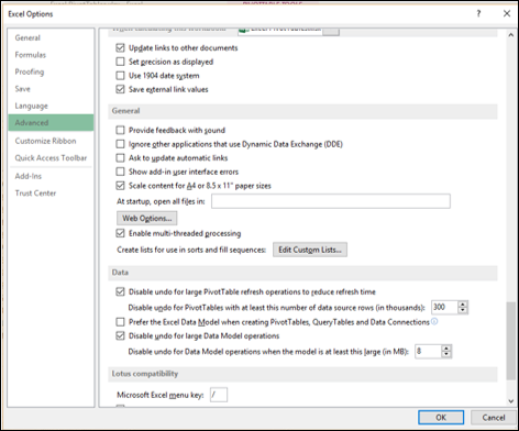
You can create your custom lists from the FILE tab on the Ribbon. FILE → Options. In the Excel Options dialog box, click on advanced and browse to General. You will find the Edit Custom Lists button next to Create lists for use in sort and fill sequences.
Note that a custom list sort order is not retained when you update (refresh) data in your PivotTable.
Under Sort By, you can click Grand Total or Values in selected columns to sort by these values. This option is not available when you set sorting to Manual.
Points to consider while sorting PivotTables
When you sort data in a PivotTable, remember the following −
Data that has leading spaces will affect the sort results. Remove any leading spaces before you sort the data.
You cannot sort case-sensitive text entries.
You cannot sort data by a specific format such as cell or font color.
You cannot sort data by conditional formatting indicators, such as icon sets.
Excel Pivot Tables - Filtering Data
You might have to do in-depth analysis on a subset of your PivotTable data. This might be because you have large data and your focus is required on a smaller portion of the data or irrespective of the size of the data, your focus is required on certain specific data. You can filter the data in the PivotTable based on a subset of the values of one or more fields. There are several ways to do that as follows −
- Filtering using Slicers.
- Filtering using Report Filters.
- Filtering data manually.
- Filtering using Label Filters.
- Filtering using Value Filters.
- Filtering using Date Filters.
- Filtering using Top 10 Filter.
- Filtering using Timeline.
You will learn filtering data using Slicers in the next chapter. You will understand filtering by the other methods mentioned above in this chapter.
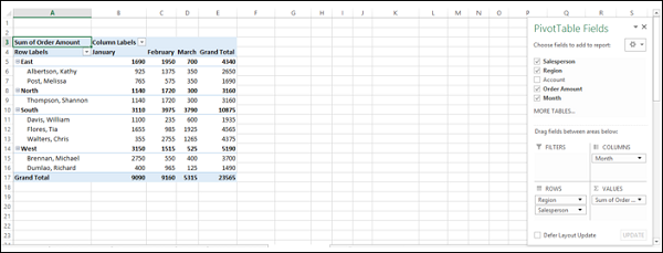
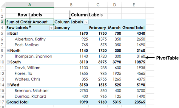
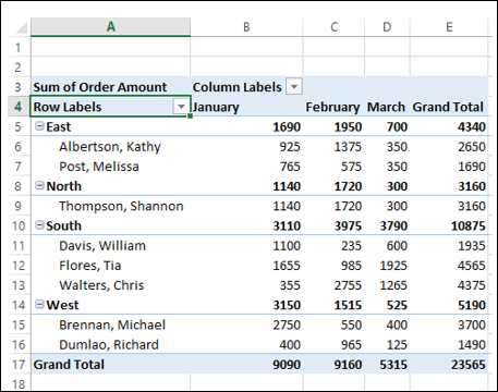
Consider the following PivotTable wherein you have the summarized sales data region wise, salesperson wise and month wise.
Report Filters
You can assign a Filter to one of the fields so that you can dynamically change the PivotTable based on the values of that field.
Drag Region from Rows to Filters in the PivotTable Areas.
The Filter with the label as Region appears above the PivotTable (in case you do not have empty rows above your PivotTable, PivotTable gets pushed down to make space for the Filter.
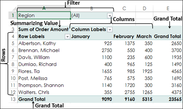
You will observe that
Salesperson values appear in rows.
Month values appear in columns.
Region Filter appears on the top with default selected as ALL.
Summarizing value is Sum of Order Amount.
Sum of Order Amount Salesperson-wise appears in the column Grand Total.
Sum of Order Amount Month-wise appears in the row Grand Total.
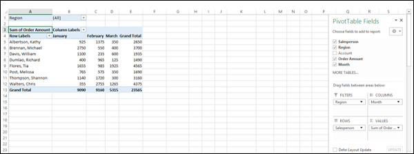
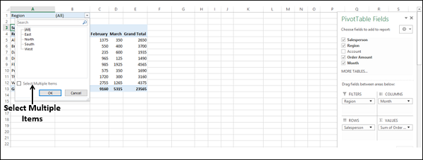
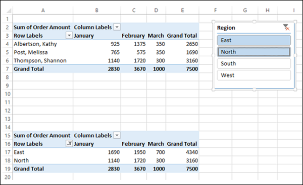
Click on the arrow in the box to the right of the Filter Region.
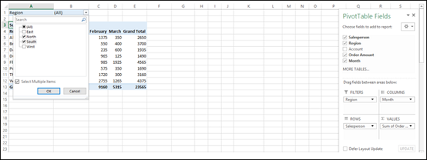
A drop-down list with the values of the field Region appears. Check the box Select Multiple Items.
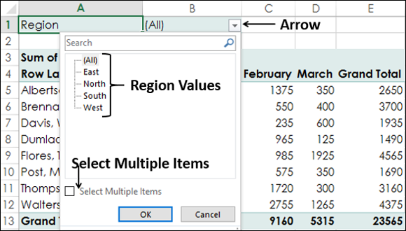
By default, all the boxes are checked. Uncheck the box (All). All the boxes will be unchecked.
Then check the boxes - South and West and click OK.
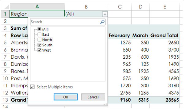
The data pertaining to South and West regions only will get summarized.
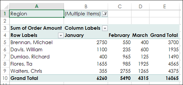
In the cell next to the Filter Region - (Multiple Items) is displayed, indicating that you have selected more than one item. However, how many items and / or which items is not known from the report that is displayed. In such a case, using Slicers is a better option for filtering.
Manual Filtering
You can also filter the PivotTable by picking the values of a field manually. You can do this by clicking on the arrow ![]() in the Row Labels or Column Labels cell.
in the Row Labels or Column Labels cell.
Suppose you want to analyze only February data. You need to filter the values by the field Month. As you can observe, Month is part of Column Labels.
Click on the arrow ![]() in the Column Labels cell.
in the Column Labels cell.
As you can observe, there is a Search box in the dropdown list and below the box, you have the list of the values of the selected field, i.e. Month. The boxes of all the values are checked, showing that all the values of that field are selected.
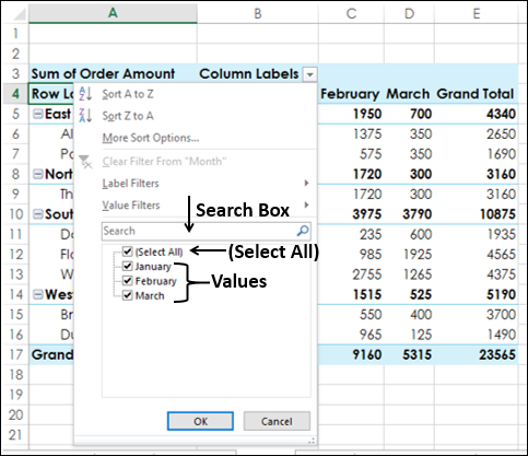
Uncheck the (Select All) box at the top of the list of values.
Check the boxes of the values you want to show in your PivotTable, in this case February and click OK.
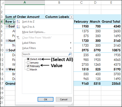
The PivotTable displays only those values that are related to the selected Month field value – February. You can observe that the filtering arrow changes to the icon  to indicate that a filter is applied. Place the cursor on the icon.
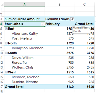
You can observe that is displayed indicating that the Manual Filter is applied on the field- Month.
If you want to change the filter selection value, do the following −
Click the
icon.Check / uncheck the boxes of the values.
If all the values of the field are not visible in the list, drag the handle in the bottom-right corner of the dropdown to enlarge it. Alternatively, if you know the value, type it in the Search box.
Suppose you want to apply another filter on the above filtered PivotTable. For example, you want to display the data of that of Walters, Chris for the month February. You need to refine your filtering by adding another filter for the field Salesperson. As you can observe, Salesperson is part of Row Labels.
Click on the arrow
in the Row Labels cell.
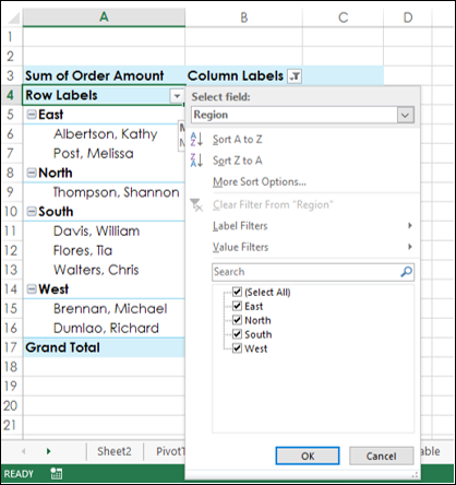
The list of the values of the field – Region is displayed. This is because, Region is at outer level of Salesperson in the nesting order. You also have an additional option – Select Field. Click on the Select Field box.
Click Salesperson from the dropdown list. The list of the values of the field – Salesperson will be displayed.
Uncheck (Select All) and check Walters, Chris.
Click OK.
The PivotTable displays only those values that are related to the selected Month field value – February and Salesperson field value - Walters, Chris.
The filtering arrow for Row Labels also changes to the icon to indicate that a filter is applied. Place the cursor on the icon on either Row Labels or Column Labels.
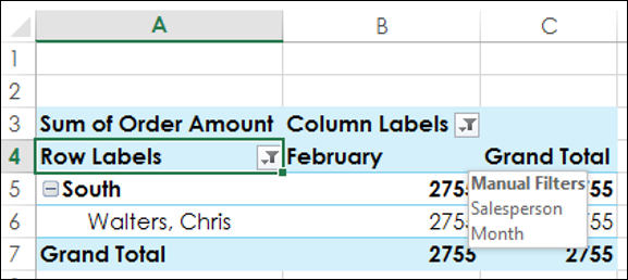
A text box is displayed indicating that the Manual Filter is applied on the fields – Month, and Salesperson.
You can thus filter the PivotTable manually based on any number of fields and on any number of values.
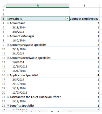
Filtering by Text
If you have fields that contain text, you can filter the PivotTable by Text, provided the corresponding field label is text-based. For example, consider the following Employee data.
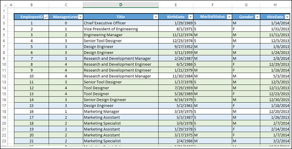
The data has the details of the employees – EmployeeID, Title, BirthDate, MaritalStatus, Gender and HireDate. Additionally, the data also has the manager level of the employee (levels 0 – 4).
Suppose you have to do some analysis on the number of employees reporting to a given employee by title. You can create a PivotTable as given below.
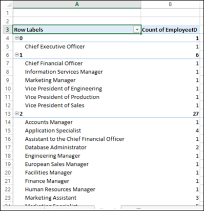
You might want to know how many employees with ‘Manager’ in their title have employees reporting to them. As the Label Title is text-based, you can apply the Label Filter on the Title field as follows −
Click on the arrow
in the Row Labels cell.Select Title in the Select Field box from the drop down list.
Click on Label Filters.
Click on Contains in the second dropdown list.
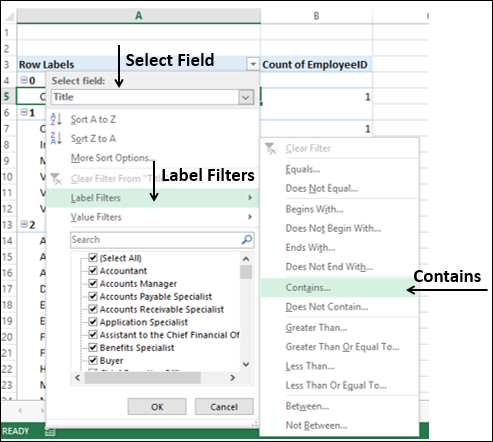
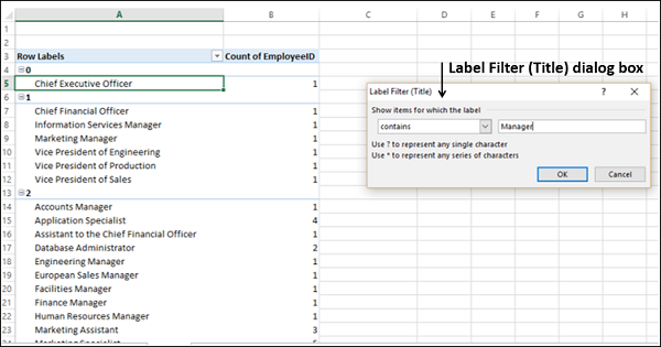
Label Filter (Title) dialog box appears. Type Manager in the box next to Contains. Click OK.
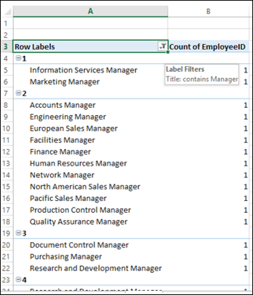
The PivotTable will be filtered to the Title values containing ‘Manager’.
Click the
icon.
You can see that 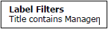 is displayed indicating the following −
- The Label Filter is applied on the field – Title, and
- What the applied Label Filter is.
Filtering by Values
You might want to know the titles of the employees who have more than 25 employees reporting to them. For this, you can apply the Value Filter on the Title field as follows −
Click on the arrow
in the Row Labels cell.Select Title in the Select Field box from the drop down list.
Click on Value Filters.
Select Greater than or equal to from the second dropdown list.
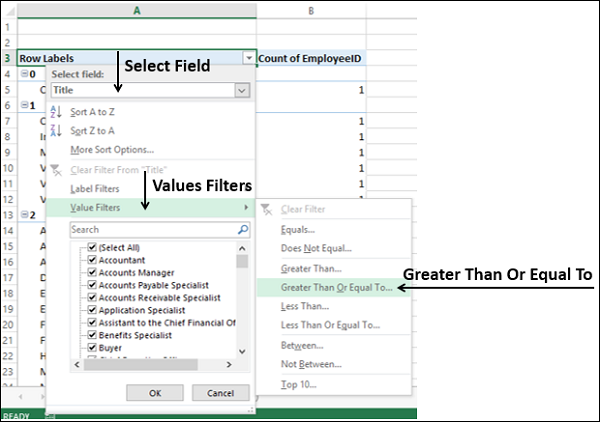
The Value Filter (Title) dialog box appears. Type 25 in the right side box.
The PivotTable will be filtered to display the employee titles who have more than 25 employees reporting to them.
Filtering by Dates
You might want to display the data of all the employees who were hired in the fiscal year 2015-15. You can use Data Filters for the same as follows −
Include the HireDate field in the PivotTable. Now, you do not require manager data and so remove ManagerLevel field from the PivotTable.
Now that you have a Date field in the PivotTable, you can use Date Filters.
Click the arrow
in the Row Labels cell.Select HireDate in the Select Field box from the drop down list.
Click Date Filters.
Seelct Between from the second dropdown list.
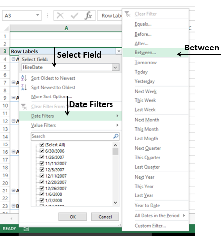
The Date Filter (HireDate) dialog box appears. Type 4/1/2014 and 3/31/2015 in the two Date boxes. Click OK.
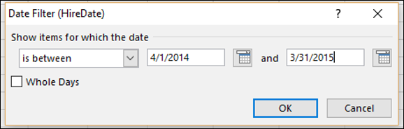
The PivotTable will be filtered to display only the data with HireDate between 1st April 2014 and 31st March 2015.
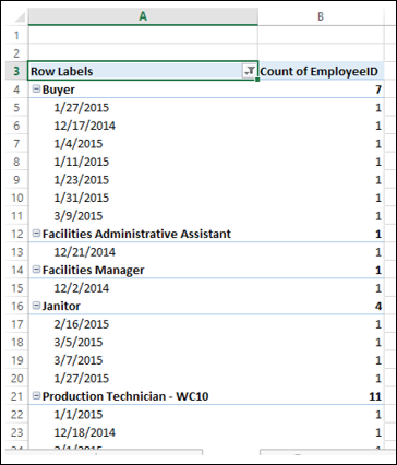
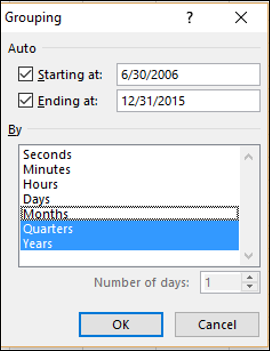
You can group the dates into Quarters as follows −
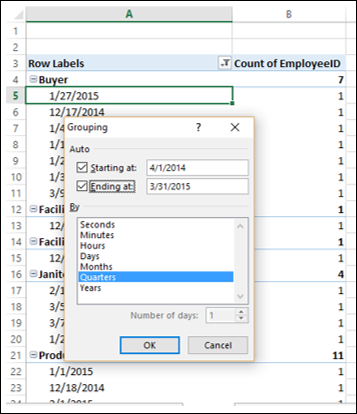
Right click on any of the dates. The Grouping dialog box appears.
Type 4/1/2014 in the box Starting at. Check the box.
Type 3/31/2015 in the box Ending at. Check the box.
Click Quarters in the box under By.
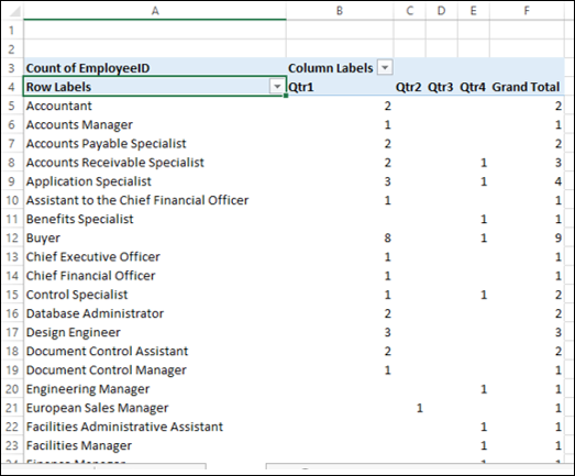
The dates will be grouped into quarters in the PivotTable. You can make the table look compact by dragging the field HireDate from ROWS area to COLUMNS area.
You will be able to know how many employees were hired during the fiscal year, quarter wise.
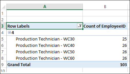
Filtering Using Top 10 Filter
You can use the Top 10 Filter to display the top few or bottom few values of a field in the PivotTable.
Click the arrow
in the Row Labels cell.Click Value Filters.
Click Top 10 in the second dropdown list.
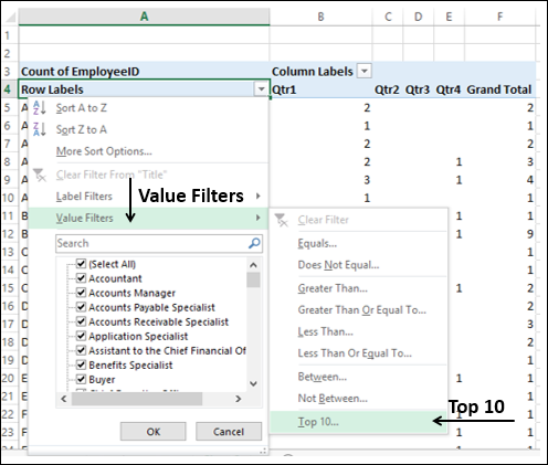
Top 10 Filter (Title) dialog box appears.
In the first box, click on Top (You can choose Bottom also).
In the second box, enter a number, say, 7.
In the third box, you have three options by which you can filter.
Click on Items to filter by number of items.
Click on Percent to filter by percentage.
Click on Sum to filter by sum.
As you have count of EmployeeID, click Items.
In the fourth box, click on the field Count of EmployeeID.
Click OK.
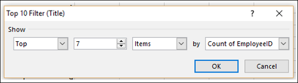
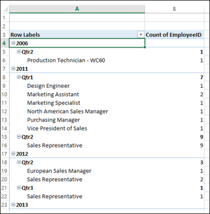
The top seven values by count of EmployeeID will be displayed in the PivotTable.
As you can observe, the highest number of hires in the fiscal year is that of Production Technicians and a predominant number of these are in Qtr1.
Filtering Using Timeline
If your PivotTable has a date field, you can filter the PivotTable using Timeline.
Create a PivotTable from the Employee Data that you used earlier and add the data to the Data Model in the Create PivotTable dialog box.
Drag the field Title to ROWS area.
Drag the field EmployeeID to ∑ VALUES area and choose Count for calculation.
Click on the PivotTable.
Click the INSERT tab.
Click Timeline in the Filters group. The Insert Timelines dialog box appears.
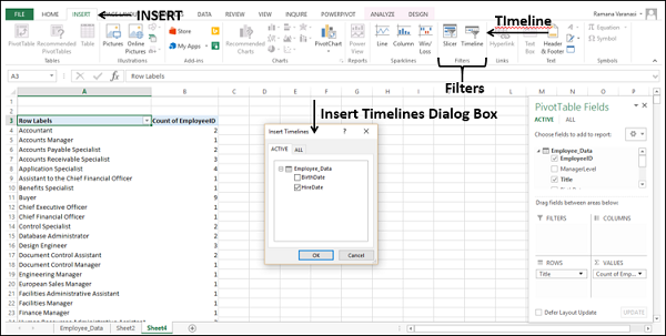
- Check the box HireDate.
- Click OK. The Timeline appears in the worksheet.
- Timeline Tools appear on the Ribbon.
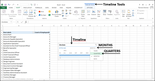
As you can observe, All Periods – in Months are displayed on the Timeline.
Click on the arrow next to - MONTHS.
Select QUARTERS from the drop-down list. The The Timeline display changes to All Periods – in Quarters.
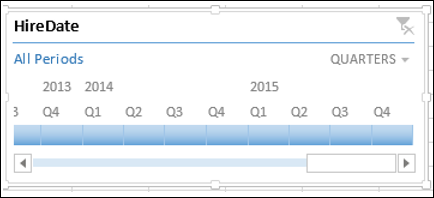
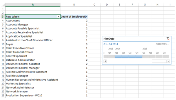
Click on 2014 Q1.
Keep the Shift key pressed and drag to 2014 Q4. The Timeline Period is selected to Q1 – Q4 2014.
PivotTable is filtered to this Timeline Period.
Clearing the Filters
You might have to clear the filters you have set from time to time to switch across different combinations and projections of your data. You can do this in several ways as follows −
Clearing all the filters in a PivotTable
You can clear all the filters set in a PivotTable at one go as follows −
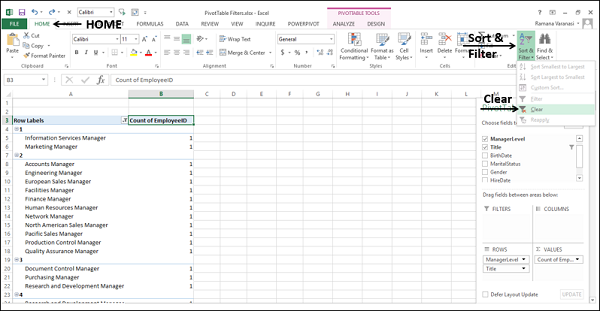
- Click the HOME tab on the Ribbon.
- Click Sort & Filter in the Editing group.
- Select Clear from the dropdown list.
Clearing a Label, Date or Value Filter
To clear a Label, Date, or Value Filter do the following −
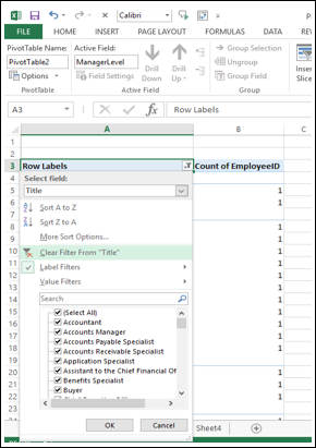
Click on the icon in the Row Labels or Column Labels.
Click on the
<field name> from which you want to clear the filter in the Select Field box in the dropdown list.Click on Clear Filter From <Filed Name> that appears in the dropdown list.
Click OK. The specific filter will be cleared.
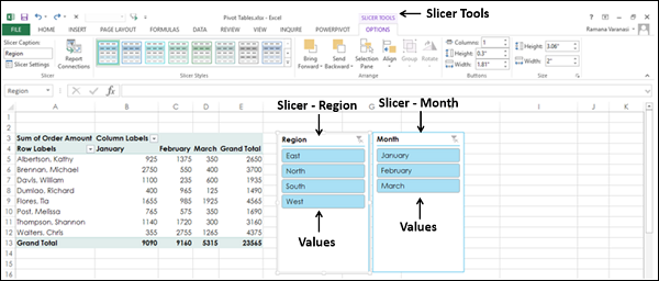
Filtering data using Slicers
Using one or more slicers is a quick and effective way to filter your data. Slicers can be inserted for each of the fields that you want to filter. Slicer will have buttons denoting the values of the field that it represents. You can click on the buttons of a slicer to select/ unselect the values in the field.
Slicers stay visible with the PivotTable and so you will always know what fields are used for filtering and what values in those fields are shown or hidden in the filtered PivotTable.
To understand the usage of slicers, consider the example of sales data region-wise, month wise and salesperson-wise. Assume you have the following PivotTable with this data.
Inserting Slicers
Suppose you want to filter this PivotTable based on the fields – Region and Month.
Click on ANALYZE under PIVOTTABLE TOOLS on the Ribbon.
Click on Insert Slicer in the Filter group. The Insert Slicers dialog box appears. It contains all the fields from your data table.
Check the boxes Region and Month.
Click OK.
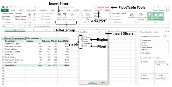
Slicers for each of the selected fields appear with all the values selected by default. Slicer Tools appear on the Ribbon to work on the Slicer settings, look and feel.
Filtering with Slicers
As you can observe, each slicer has all the values of the field that it represents and the values are displayed as buttons. By default, all the values of a field are selected and hence all the buttons are highlighted.
Suppose you want to display the PivotTable only for the regions South and West and for the Months February and March.
Click on South in the Slicer for Region. Only South will be highlighted in the Slicer – Region.
Keep Ctrl key pressed and click on West in the Slicer for Region.
Click on February in the Slicer for Month.
Keep Ctrl key pressed and click on March in the Slicer for Month.
Selected items in the Slicers are highlighted. PivotTable with summarized values for the selected items will be displayed.
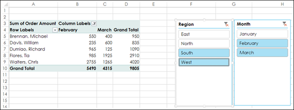
To add/remove values of a field from the filter, keep the Ctrl key pressed and click on those buttons in the slicer of the field.
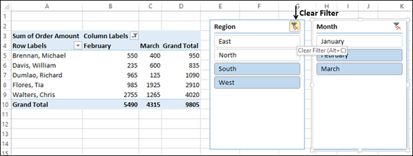
Clearing the Filter in a Slicer
To clear the filter in a slicer, click on  at the top-right corner of the slicer.
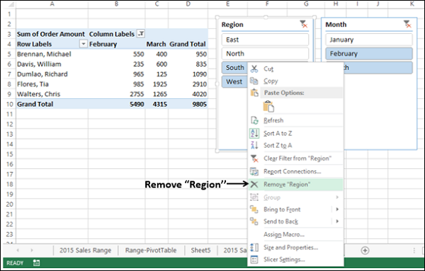
Removing a Slicer
Suppose you want to remove the slicer for the Region field.
- Right click on the Slicer – Region.
- Click on Remove “Region” in the dropdown list.
Slicer Tools
Once you insert a slicer, Slicer Tools appear on the Ribbon with OPTIONS tab. To view Slicer Tools, click on a slicer.
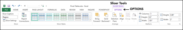
As you can observe, under the Slicer Tools – OPTION tab, you have several options to change the look and feel of the slicer that include −
- Slicer Caption
- Slicer Settings
- Report Connections
- Selection Pane
Slicer Caption
You can find the Slicer Caption box in the Slicer group. The Slicer Caption is the header that is displayed on the slicer. By default, Slicer Caption is the name of the field that it represents.
- Click on the Slicer for Region.
- Click the OPTIONS tab on the Ribbon.
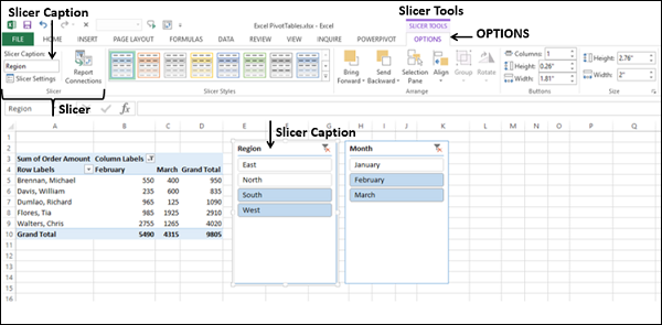
The Slicer group on the Ribbon, in the Slicer Caption box, Region is displayed as the header of the slicer. It is the name of the field for which the slicer is inserted. You can change the Slicer Caption as follows −
Click on the Slicer Caption box in the Slicer group on the Ribbon.
Delete Region. The box is cleared.
Type Location in the box and press Enter. The Slicer Caption changes to Location and the same is reflected as header in the slicer.
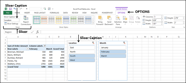
Note − You have changed only the slicer caption, i.e. the header. The name of the field that the slicer represents – Region remains as it is.
Slicer Settings
You can use Slicer Settings to change the name of the slicer, change the slicer caption, choose whether to display the slicer header or not and set the sorting and filtering options for the items −
Click on the slicer - Location.
Click the OPTIONS tab on the Ribbon. You can find the Slicer Settings in the Slicer group on the Ribbon. You can also find Slicer Settings in the dropdown list when you right click on the slicer.
Click the Slicer Settings. The Slicer Settings dialog box appears.
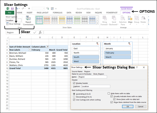
As you can observe, the following are fixed for the slicer −
- Source Name.
- Name to use in formulas.
You can change the following for the slicer −
- Name.
- Header – Caption.
- Display header.
- Sorting and Filtering options for the items displayed on the slicer.
Report Connections
You can connect different PivotTables to a Slicer, provided one of the following holds good −
The PivotTables are created using the same data.
One PivotTable has been copied and pasted as an additional PivotTable.
Multiple PivotTables are created on separate sheets with Show Report Filter Pages.
Consider the following PivotTables that are created from the same data −
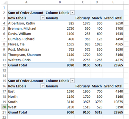
- Name the top PivotTable as PivotTable-Top and the bottom one as PivotTable-Bottom.
- Click on the top PivotTable.
- Insert a Slicer for the field Region.
- Select East and North on the Slicer.
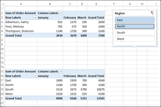
Observe that the filtering is applied only to the top PivotTable and not to the bottom PivotTable. You can use the same slicer for both the PivotTables by connecting it to the bottom PivotTable also as follows −
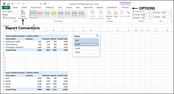
- Click on the slicer - Region. The SLICER TOOLS appear on the Ribbon.
- Click the OPTIONS tab on the Ribbon.
You will find Report Connections in the Slicer group on the Ribbon. You can also find Report Connections in the dropdown list when you right click on the slicer.
Click Report Connections in the Slicer group.
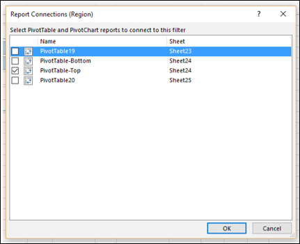
The Report Connections dialog box appears. The box PivotTable-Top is checked and other boxes are unchecked. Check the box PivotTable-Bottom also and click OK.
The bottom PivotTable will be filtered to the selected items – East and North.
This became possible because both the PivotTables are now connected to the slicer. If you make changes in the selections in the slicer, the same filtering will appear in both the PivotTables.
Selection Pane
You can switch the display of the slicers on the worksheet off and on using the Selection Pane.
Click on the slicer - Location.
Click the OPTIONS tab on the Ribbon.
Click the Selection Pane in the Arrange group on the Ribbon. The Selection Pane appears on the right side of the window.
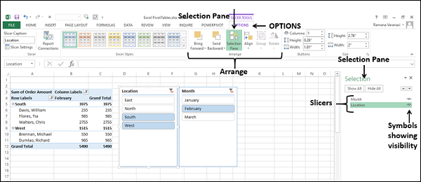
As you can observe, the names of all the slicers are listed in the Selection pane. On the right side of the names, you can find the visibility symbol -  indicating the slicer is visible on the worksheet.
Click the symbol for Month. The symbol changes to the symbol  , indicating that the slicer is hidden (not visible).
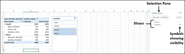
As you can observe, the slicer – Month is not shown on the worksheet. However, remember that you did not remove the slicer for Month, but you have just hidden it.
Click on the
symbol for Month.The symbol
changes to the symbol , indicating that the slicer is now visible.
When you switch the visibility of a slicer on / off, the selection of the items in that slicer for filtering remain unaltered. You can also change the order of the slicers in the Selection pane by dragging them up/down.
Excel Pivot Tables - Nesting
If you have more than one field in any of the PivotTable areas, then the PivotTable layout depends on the order you place the fields in that area. This is called the Nesting Order.
If you know how your data is structured, you can place the fields in the required order. If you are not sure about the structure of the data, you can change the order of the fields that instantly changes the layout of the PivotTable.
In this chapter, you will understand the nesting order of the fields and how you can change the nesting order.
Nesting Order of the Fields
Consider the sales data example, where you have placed the fields in the following order −
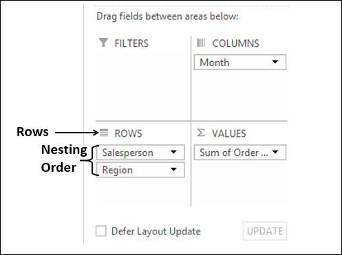
As you can see, in the rows area there are two fields – salesperson and region in that order. This order of the fields is called nesting order i.e. Salesperson first and Region next.
In the PivotTable, the values in the rows will be displayed based on this order, as given below.
As you can observe, the values of the second field in the nesting order are embedded under each of the values of the first field.
In your data, each salesperson is associated with only one region, whereas most of the regions are associated with more than one salesperson. Hence, there is a possibility that if you reverse the nesting order, your PivotTable will look more meaningful.
Changing the Nesting Order
To change the nesting order of the fields in an area, just click the field and drag it to the position you want.
Click on the field Salesperson in the ROWS area, and drag it to below the field Region. Thus, you have changed the nesting order to – Region first and Salesperson next, as follows −
The resulting PivotTable will be as given below −
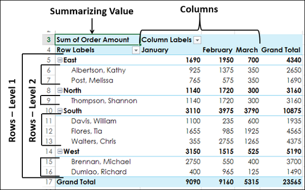
You can clearly observe that the Layout with the nesting order – Region and then Salesperson yields a better and compact report than the one with the nesting order – Salesperson and then Region.
In case a Salesperson represents more than one area and you need to summarize the sales by Salesperson, then the previous Layout would have been a better option.
Excel Pivot Tables - Tools
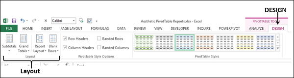
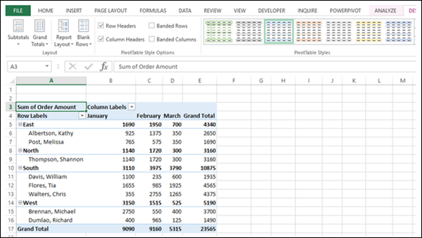
In the worksheet containing a PivotTable, the Ribbon will contain the PivotTable Tools, with ANALYZE and DESIGN Tabs. The ANALYZE tab has several commands that will enable you to explore the data in the PivotTable. The DESIGN tab commands will be useful to structure the PivotTable with various report options and style options.
You will learn the ANALYZE commands in this chapter. You will learn the DESIGN commands in the Chapter - Aesthetic Reports with PivotTables.
ANALYZE Commands
The commands on the Ribbon of ANALYZE tab include the following −
- Expanding and Collapsing a Field.
- Grouping and Ungrouping Field Values.
- Active Field Settings.
- PivotTable Options.
Expanding and Collapsing a Field
If you have nested fields in your PivotTable, you can expand and collapse a single item or you can expand and collapse all the items of the active field.
Consider the following PivotTable, wherein you have Salesperson field nested under Region field.
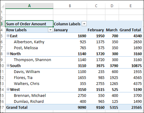
Click the  symbol to the left of East. The item East of the field Region will collapse.
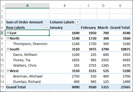
As you can observe, the other items - North, South and West of the field Region are not collapsed. If you want to collapse any of them, repeat the steps that you have done for East.
Click on the
 symbol to the left of East. The item East of the field Region will expand.
If you want to collapse all the items of a field at once, do the following −
- Click any of the items of the field – Region.
- Click the ANALYZE tab on the Ribbon.
- Click Collapse Field in the Active Field group.
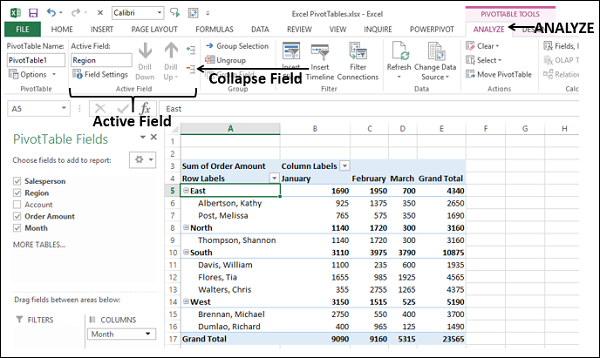
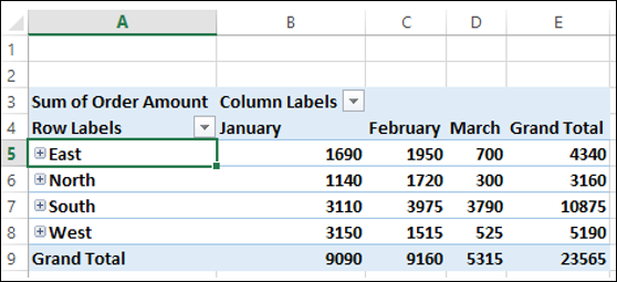
All the items of the field Region will be collapsed.
If you want to expand all the items of a field at once, do the following −
- Click on any of the items of the field – Region.
- Click the ANALYZE tab on the Ribbon.
- Click Expand Field in the Active Field group.
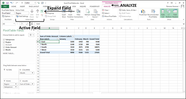
All the items of the field Region will be expanded.
Grouping and Ungrouping Field Values
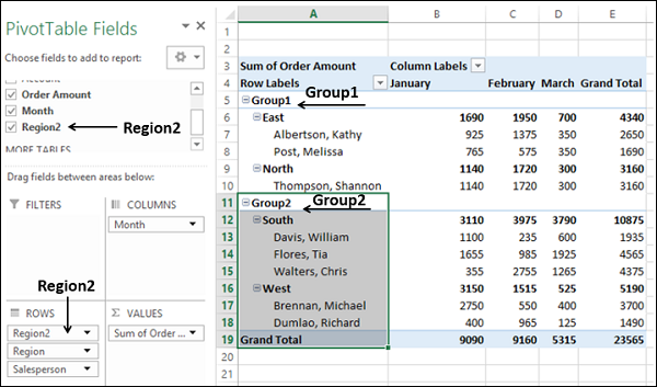
You can group and ungroup field values to define your own clustering. For example, you might want to know the data combining East and North regions.
Select the East and North items of the Region field in the PivotTable, along with the nested Salesperson field items.
Click the ANALYZE tab on the Ribbon.
Click Group Selection in the group – Group.
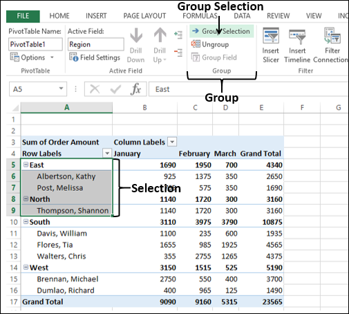
The items – East and North will be grouped under the name Group1. In addition, a new South is created under which South is nested and a new West is created under which West is nested.
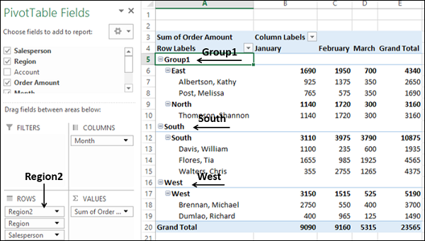
You can also observe that a new field – Region2 is added in the PivotTable Fields list, which appears in the ROWS area.
Select the South and West items of the Region2 field in the PivotTable, along with the nested Region and Salesperson field items.
Click the ANALYZE tab on the Ribbon.
Click Group Selection in the group – Group.
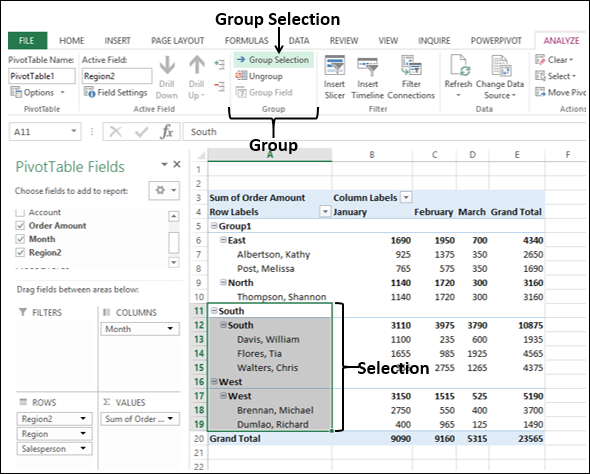
The items – South and West of the field Region will be grouped under the name Group2.
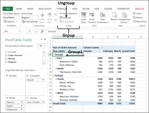
To ungroup a group, do the following −
- Click on the Group Name.
- Click the ANALYZE tab.
- Click Ungroup in the group – Group.
Grouping by a Date Field
Consider the following PivotTable, wherein you have the employee data summarized by Count of EmployeeID, hiredate wise and title wise.
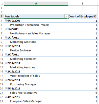
Suppose you want to group this data by the HireDate field that is a Date field into years and quarters.
- Click on a Date item in the PivotTable.
- Click the ANALYZE tab on the Ribbon.
- Click Group Field in the group – Group.
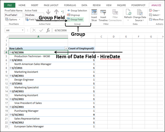
The Grouping dialog box appears.
Set the dates for – Starting at and Ending at.
Select Quarters and Years in the box under By. To select / deselect multiple items, keep the Ctrl-key pressed.
Click OK.
The HireDate field values will be grouped into Quarters, nested in Years.
If you want to ungroup this grouping, you can do as shown earlier, by clicking Ungroup in the group – Group on the Ribbon.
Active Value Field Settings
You can set a field options by clicking on a value of that field. Consider the example of sales data that we used earlier in this chapter.
Suppose you want to set the options for the Region field.
Click on East. On the Ribbon, in the Active Field group, in the Active Field box, Region will be displayed.
Click on Field Settings. The Field Settings dialog box appears.
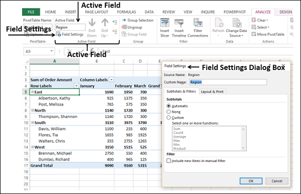
You can set your preferences for the field – Region.
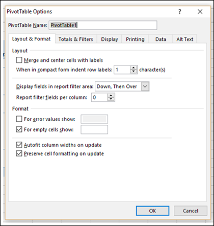
PivotTable Options
You can set the PivotTable Options according to your preferences.
- Click on the PivotTable.
- Click the ANALYZE tab.
- Click Options in the PivotTable group.
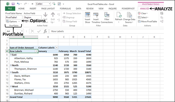
The PivotTable Options dialog box appears. You can set your preferences in the dialog box.
Excel Pivot Tables - Summarizing Values
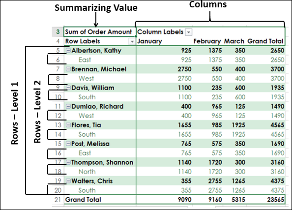
You can summarize a PivotTable by placing a field in ∑ VALUES area in the PivotTable Fields Task pane. By default, Excel takes the summarization as sum of the values of the field in ∑ VALUES area. However, you have other calculation types, such as, Count, Average, Max, Min, etc.
In this chapter, you will learn how to set a calculation type based on how you want to summarize the data in the PivotTable.
Sum
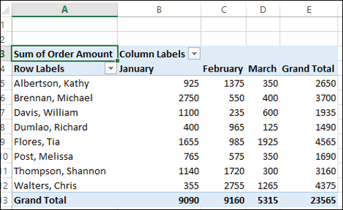
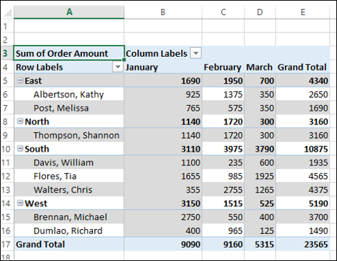
Consider the following PivotTable wherein you have the summarized sales data regionwise, salesperson-wise and month-wise.
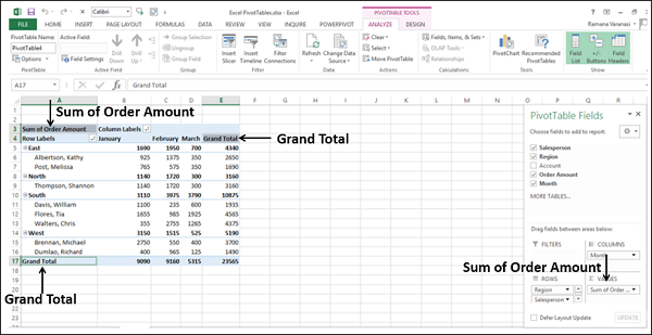
As you can observe, when you drag the field Order Amount to ∑ VALUES area, it is displayed as Sum of Order Amount, indicating the calculation is taken as Sum. In the PivotTable, in the top-left corner, Sum of Order Amount is displayed. Further, Grand Total column and Grand Total row are displayed for subtotals field-wise in rows and columns respectively.
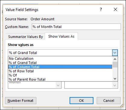
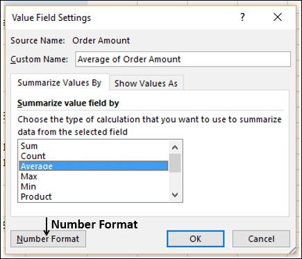
Value Field Settings
With Values Field Settings, you can set the calculation type in your PivotTable. You can also decide on how you want to display your values.
- Click on Sum of Order Amount in ∑ VALUES area.
- Select Value Field Settings from the dropdown list.
The Value Field Settings dialog box appears.
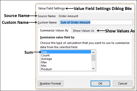
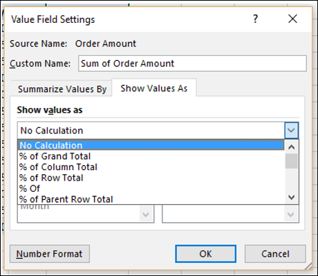
The Source Name is the field and Custom Name is Sum of field. Calculation Type is Sum. Click the Show Values As tab.
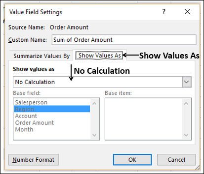
In the box Show Values As, No Calculation is displayed. Click the Show Values As box. You can find several ways of showing your total values.
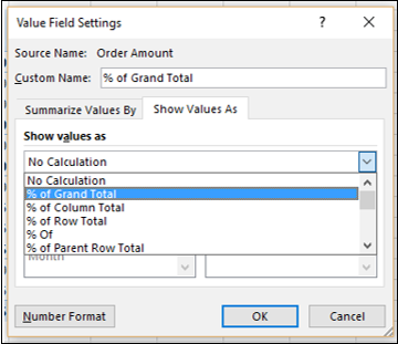
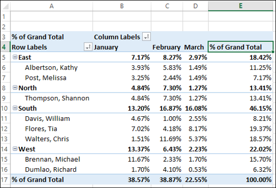
% of Grand Total
You can show the values in the PivotTable as % of Grand Total.
- In the Custom Name box, type % of Grand Total.
- Click on the Show Values As box.
- Click on % of Grand Total in the dropdown list. Click OK.
The PivotTable summarizes the values as % of the Grand Total.
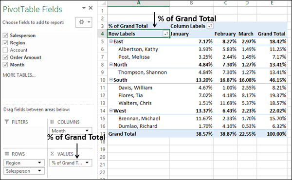
As you can observe, Sum of Order Amount in the top-left corner of the PivotTable and in the ∑ VALUES area in the PivotTable Fields pane is changed to the new Custom Name - % of Grand Total.
Click on the header of the Grand Total column.
Type % of Grand Total in the formula bar. Both the Column and Row headers will change to % of Grand Total.
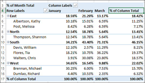
% of Column Total
Suppose you want to summarize the values as % of each month total.
Click on Sum of Order Amount in ∑ VALUES area.
Select Value Field Settings from the dropdown list. The Value Field Settings dialog box appears.
In the Custom Name box, type % of Month Total.
Click on the Show values as box.
Select % of Column Total from the dropdown list.
Click OK.
The PivotTable summarizes the values as % of the Column Total. In the Month columns, you will find the values as % of the specific month total.
Click on the header of the Grand Total column.
Type % of Column Total in the formula bar. Both the Column and Row headers will change to % of Column Total.
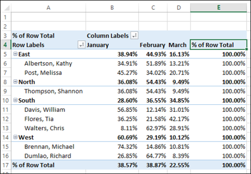
% of Row Total
You can summarize the values as % of region totals and % of salesperson totals, by selecting % of Row Total in Show Values As box in the Value Field Settings dialog box.
Count
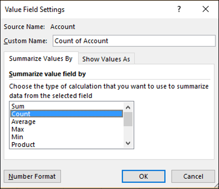
Suppose you want to summarize the values by the number of Accounts region wise, salesperson wise and month wise.
Deselect Order Amount.
Drag Account to ∑ VALUES area. The Sum of Account will be displayed in the ∑ VALUES area.
Click on Sum of Account.
Select Value Field Settings from the dropdown list. The Value Field Settings dialog box appears.
In the Summarize value field by box, select Count. The Custom Name changes to Count of Account.
Click OK.
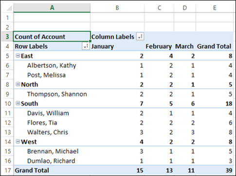
The Count of Account will be displayed as shown below −
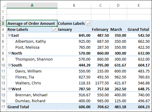
Average
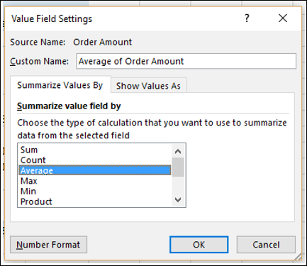
Suppose you want to summarize the PivotTable by average values of Order Amount region wise, salesperson wise and month wise.
Deselect Account.
Drag Order Amount to ∑ VALUES area. The Sum of Order Amount will be displayed in the ∑ VALUES area.
Click on Sum of Order Amount.
Click on Value Field Settings in the dropdown list. The Value Field Settings dialog box appears.
In the Summarize value field by box, click on Average. The Custom Name changes to Average of Order Amount.
Click OK.
The average will be displayed as shown below −
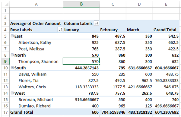
You have to set the number format of the values in the PivotTable to make it more presentable.
Click on Average of Order Amount in ∑ VALUES area.
Click on Value Field Settings in the dropdown list. The Value Field Settings dialog box appears.
Click on the Number Format button.
The Format Cells dialog box appears.
- Click on Number under Category.
- Type 2 in the Decimal places box and click OK.
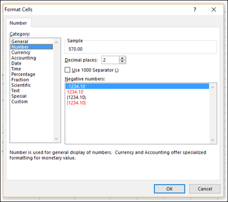
The PivotTable values will be formatted to numbers with two decimal places.
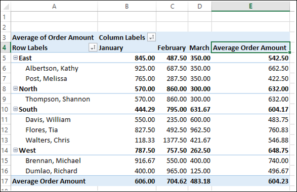
Click on the header of the Grand Total column.
Type Average Order Amount in the formula bar. Both the Column and Row headers will change to Average Order Amount.
Max
Suppose you want to summarize the PivotTable by the maximum values of Order Amount region-wise, salesperson-wise and month-wise.
Click on Sum of Order Amount.
Select Value Field Settings from the dropdown list. The Value Field Settings dialog box appears.
In the Summarize value field by box, click Max. The Custom Name changes to Max of Order Amount.
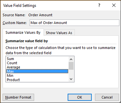
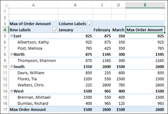
The PivotTable will display the maximum values region wise, salesperson wise and month wise.
Click on the header the Grand Total column.
Type Max Order Amount in the formula bar. Both the Column and Row headers will change to Max Order Amount.
Min
Suppose you want to summarize the PivotTable by the minimum values of Order Amount region wise, salesperson wise and month wise.
Click on Sum of Order Amount.
Click on Value Field Settings in the dropdown list. The Value Field Settings dialog box appears.
In the Summarize value field by box, click Min. The Custom Name changes to Min of Order Amount.
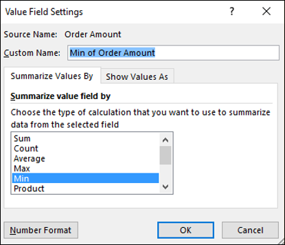
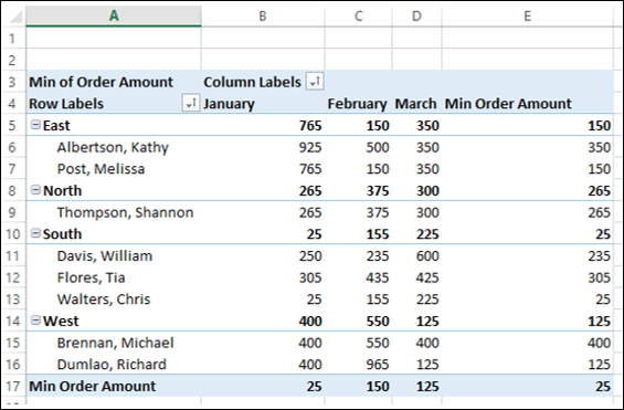
The PivotTable will display the minimum values region wise, salesperson wise and month wise.
Click on the header of the Grand Total column.
Type Min Order Amount in the formula bar. Both the Column and Row headers will change to Min Order Amount.
Excel Pivot Tables - Updating Data
You have learnt how to summarize data with a PivotTable. The data on which the PivotTable is based might be updated either periodically or on occurrence of an event. Further, you also might require to change the PivotTable Layout for different reports.
In this chapter, you will learn the different ways of updating the Layout and / or refreshing the data in a PivotTable.
Updating PivotTable Layout
You can decide whether your PivotTable is to be updated whenever you make changes to the layout or it is to be updated by a separate trigger.
As you have learnt earlier, in the PivotTable Fields task pane, on the bottom side, you will find a check box for Defer Layout Update. By default, it is unchecked, which means the PivotTable Layout gets updated as soon as you make changes in the PivotTable areas.
Check the option − Defer Layout Update.
The UPDATE button next to it will be enabled. If you make any changes to the PivotTable areas, the changes will be reflected only after you click on the UPDATE button.
Refreshing PivotTable Data
When the data of a PivotTable is changed in its source, the same can be reflected in the PivotTable by refreshing it.
- Click on the PivotTable.
- Click the ANALYZE tab on the Ribbon.
- Click Refresh in the Data group.
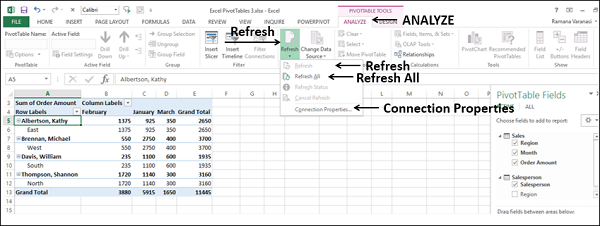
There are different options to refresh the data in the dropdown list −
Refresh − To get the latest data from the source connected to the active cell.
Refresh All − To get the latest data by refreshing all sources in the workbook.
Connection Properties − To set the refresh properties for the workbook connections.
Changing the Source Data of a PivotTable
You can change the range of the source data of a PivotTable. For e.g., you can expand the source data to include more number of rows of data.
However, if the source data has been changed substantially, such as having more or fewer columns, consider creating a new PivotTable.
Click on the PivotTable. PIVOTTABLE TOOLS appear on the Ribbon.
Click the ANALYZE tab.
Click Change Data Source in the Data group.
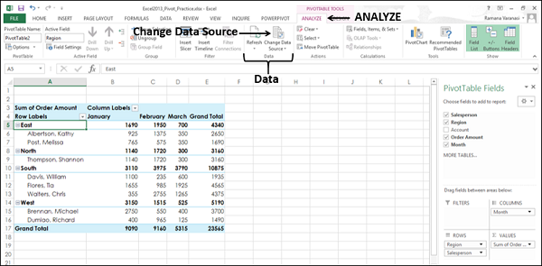
Select Change Data Source from the dropdown list.
Change PivotTable Data Source dialog box appears and the current Data Source will be highlighted.
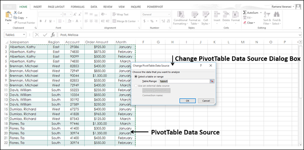
Select the Table or the Range you want to include in the Table/Range Box under Select a Table or Range. Click OK.
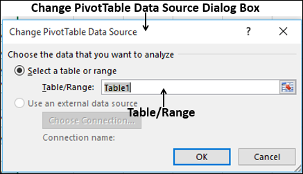
The data source for the PivotTable will be changed to the selected Table/Range of data.
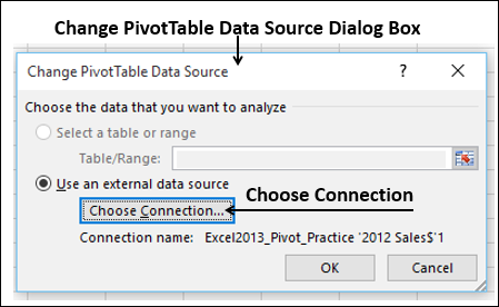
Changing to External Data Source
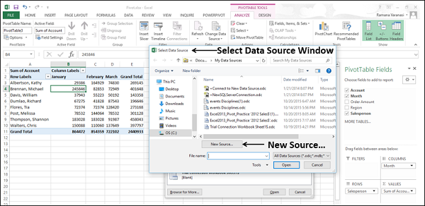
If you want to change the data source for your PivotTable that is an external one, it might be best to create a new PivotTable. However, if the location of your external data source is changed, for example, your SQL Server database name is the same, but it has been moved to a different server, or your Access database has been moved to another network share, you can change your current data connection to reflect the same.
Click on the PivotTable.
Click the ANALYZE tab on the Ribbon.
Click Change Data Source in the Data group. The Change PivotTable Data Source dialog box appears.
Click the Choose Connection button.
The Existing Connections dialog box appears.
Select All Connections in the Show box. All the Connections in your Workbook will be displayed.
Click the Browse for More button.
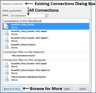
The Select Data Source window appears.
- Click on the New Source button.
- Go through the Data Connection Wizard Steps.
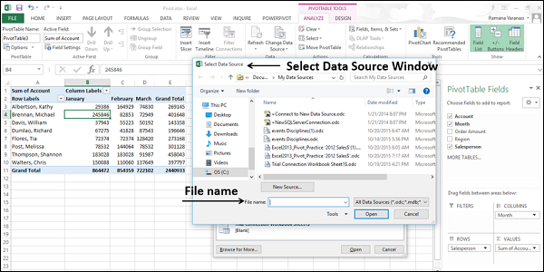
If your data source is in another Excel workbook, do the following −
- Click on the File name box.
- Select the workbook file name.
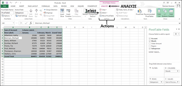
Deleting a PivotTable
You can delete a PivotTable as follows −
- Click on the PivotTable.
- Click the ANALYZE tab on the Ribbon.
- Click Select in the Actions group.
Select Entire PivotTable from the dropdown list. The entire PivotTable will be selected.
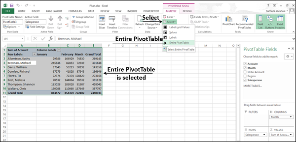
Press the Delete Key. The PivotTable will be deleted.
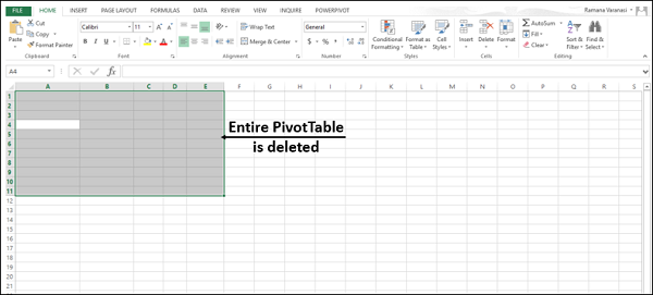
If the PivotTable is on a separate worksheet, you can also delete the PivotTable by deleting the entire worksheet.
Right-click on the worksheet tab and select Delete from the dropdown list.
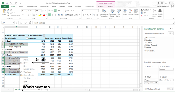
The entire worksheet along with the PivotTable is deleted.
Excel Pivot Tables - Reports
Major use of PivotTable is reporting. Once you have created a PivotTable, explored the data by arranging and rearranging the fields in its rows and columns, you will be ready to present the data to a wide range of audience. With filters, different summarizations, focusing on specific data, you will be able to generate several required reports based on a single PivotTable.
As a PivotTable report is interactive, you can quickly make the necessary changes to highlight the specific results, such as data trends, data summarizations, etc. while presenting it. You can also provide visual cues such as report filters, slicers, timeline, PivotCharts, etc. to the recipients so that they can visualize the details they want.
In this chapter, you will learn the different ways of making your PivotTable reports appealing with visual cues that enable quick exploration of the data.
Hierarchies
You have learnt how to nest fields to form a hierarchy, in the Chapter – Nesting in a PivotTable in this tutorial. You have also learnt how to group / ungroup data in a PivotTable in the Chapter – Using PivotTable Tools. We will take few examples to show you how to produce interactive PivotTable reports with hierarchies.
If you have an in-built structure for the fields in your data, such as, Year-Quarter-Month, nesting the fields to form a hierarchy will enable you to quickly expand/collapse fields to view the summarized values at the required level.
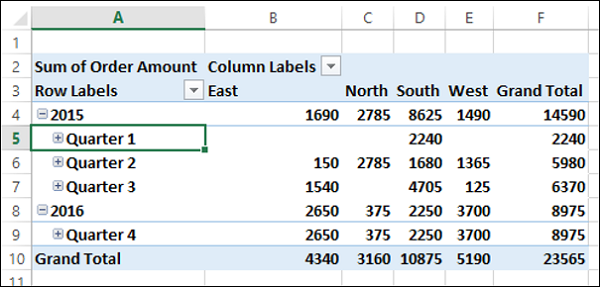
For example, suppose you have the sales data for the fiscal year 2015-16 for the regions – East, North, South and West, as given below.
Create a PivotTable as shown below.
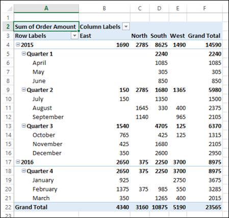
As you can observe, this is a comprehensive way of reporting the data using the nested fields as a hierarchy. If you want to display the results only at the level of Quarters, you can quickly collapse the Quarter field.
Suppose you have a Date field in your data as shown below.
In such a case, you can group the data by the Date field as follows −
Create a PivotTable.
As you can observe, this PivotTable is not convenient to highlight significant data.
Group the PivotTable by Date field. (You have learnt grouping in the Chapter – Exploring Data with PivotTable Tools in this tutorial).
Place the Salesperson field in Filters area.
Filter the Column labels to East Region.
Report Filter
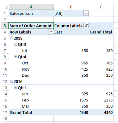
Suppose you want a report for each Salesperson separately. You can do it as follows −
- Ensure that you have Salesperson field in Filters area.
- Click on the PivotTable.
- Click the ANALYZE tab on the Ribbon.
- Click the arrow next to Options in the PivotTable group.
- Select Show Report Filter Pages from the dropdown list.
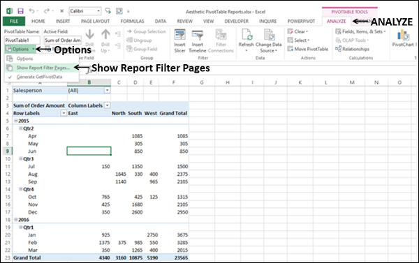
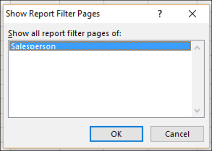
The Show Report Filter Pages dialog box appears. Select the field Salesperson and click OK.
A separate worksheet for each of the values of the Salesperson field is created, with the PivotTable filtered to that value.
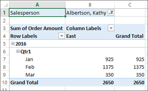
The worksheet will be named by the value of the field, which is visible on the tab of the worksheet.
Slicers
Another sophisticated feature that you have in PivotTables is Slicer that can be used to filter the fields visually.
Click on the PivotTable.
Click the ANALYZE tab.
Click Insert Slicer in the Filter group.
Click Order Date, Quarters and Years in the Insert Slicers dialog box. Three Slicers –Order Date, Quarters and Year will get created.
Adjust the sizes of the slicers, adding more columns for the buttons on the slicers.
Create Slicers for Salesperson and Region fields also.
Choose the Slicer Styles so that date fields are grouped to one color and the other two fields get different colors.
Deselect Gridlines.
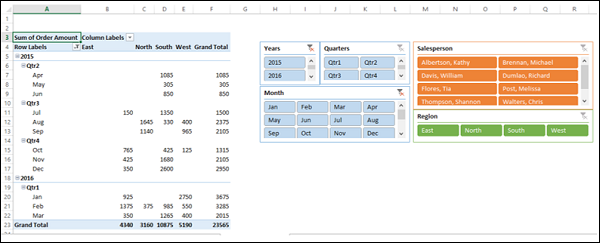
As you can see, you have not only an interactive report, but also an appealing one, that can be understood easily.
Timeline in PivotTable
When you have a Date field in your PivotTable, inserting a Timeline also is an option to produce an aesthetic report.
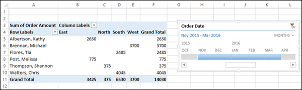
- Create a PivotTable with Salesperson in ROWS area and Region in COLUMNS area.
- Insert a Timeline for the field Order Date.
- Filter the Timeline to show 5 months data, from November 2015 to March 2016.
DESIGN Commands
The PIVOTTABLE TOOLS - DESIGN commands on the Ribbon provide you with the options to format a PivotTable, including the following −
- Layout
- PivotTable Style Options
- PivotTable Styles
Layout
You can have PivotTable Layout based on your preferences for the following −
- Subtotals
- Grand Totals
- Report Layout
- Blank Rows
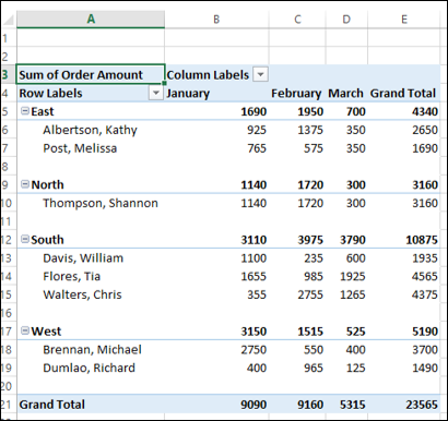
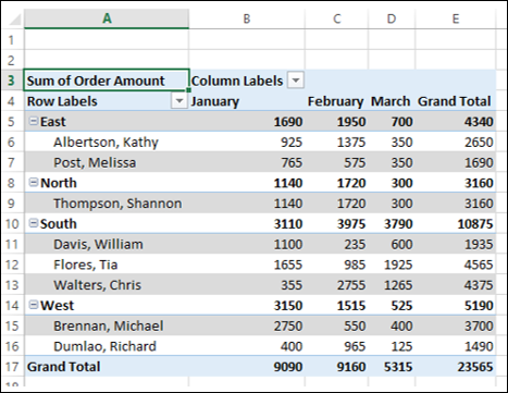
PivotTable Layout – Subtotals
You have an option whether to display Subtotals or not. By default, Subtotals are displayed, at the top of the group.
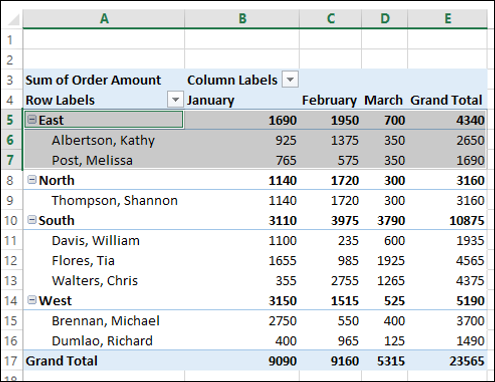
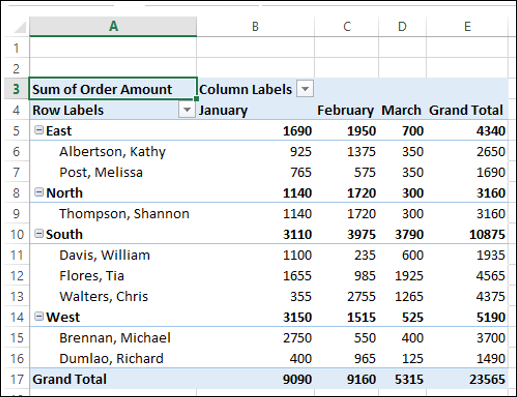
As you can observe the highlighted group – East, the subtotals are at the top of the group. You can change the position of subtotals as follows −
- Click on the PivotTable.
- Click the DESIGN tab on the Ribbon.
- Click Subtotals in the Layout Options group.
- Click Show all Subtotals at Bottom of Group.
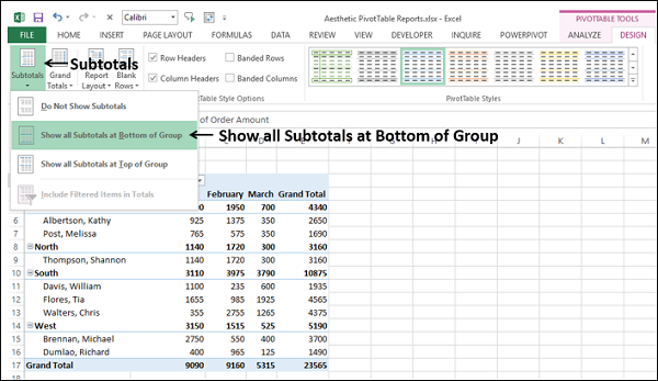
The Subtotals will now appear at the bottom of each group.
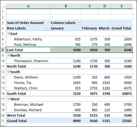
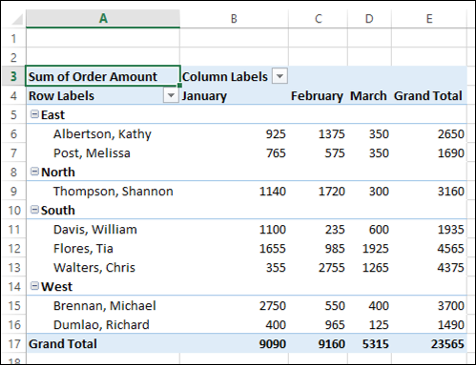
If you do not have to report the Subtotals, you can select - Do Not Show Subtotals.
Grand Totals
You can choose to either display Grand Totals or not. You have four possible combinations −
- Off for Rows and Columns
- On for Rows and Columns
- On for Rows Only
- On for Columns Only
By default, it is the second combination – On for Rows and Columns.
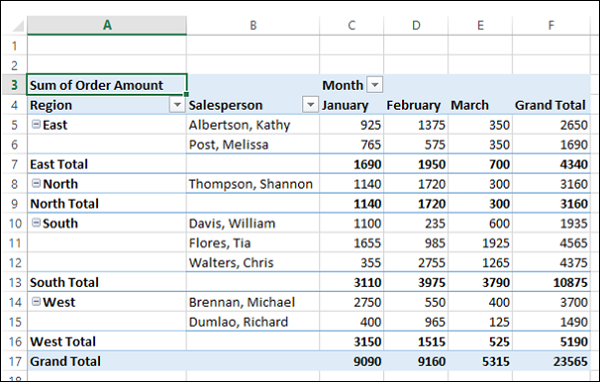
Report Layout
You can choose from the several Report Layouts, the one that best suits your data.
- Compact Form.
- Outline Form.
- Tabular Form.
You can also choose whether to repeat all the item labels or not, in case of multiple occurrences.
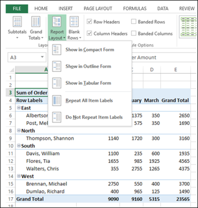
The default Report Layout is the Compact form that you are familiar with.
Compact Form
The Compact form optimizes the PivotTable for readability. The other two forms display the field headers also.
Click on Show in Outline Form.
Click Show in Tabular Form.
Consider the following PivotTable Layout, wherein the field Month is nested under the field Region −
As you can observe, the Month labels are repeated and this is the default.
Click Do Not Repeat Item Labels. The Month labels will be displayed only once and the PivotTable looks clear.
Blank Rows
To make your PivotTable Report more distinct, you can insert a blank line after each item. You can remove these Blank Lines anytime later.
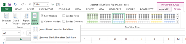
Click Insert Blank Line after Each Item.
PivotTable Style Options
You have the following PivotTable Style Options −
- Row Headers
- Column Headers
- Banded Rows
- Banded Columns
By default, the boxes for Row Headers and Column Headers are checked. These options are for displaying special formatting for the first row and the first column respectively. Check the box Banded Rows.
Check the box Banded Columns.
PivotTable Styles
You can choose several PivotTable Styles. Select the one that suits your report. For example, if you choose Pivot Style Dark 5, you will get the following style for the PivotTable.
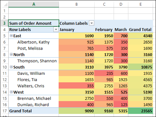
Conditional Formatting in PivotTable
You can set Conditional Formatting on the PivotTable cells by the values.
PivotCharts
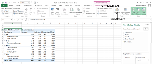
PivotCharts add a visual emphasis on your PivotTable reports. You can insert a PivotChart tied to the data of a PivotTable as follows −
- Click on the PivotTable.
- Click the ANALYZE tab on the Ribbon.
- Click PivotChart.
The Insert Chart dialog box appears.
Click Column in the left pane and select Stacked Column. Click OK.
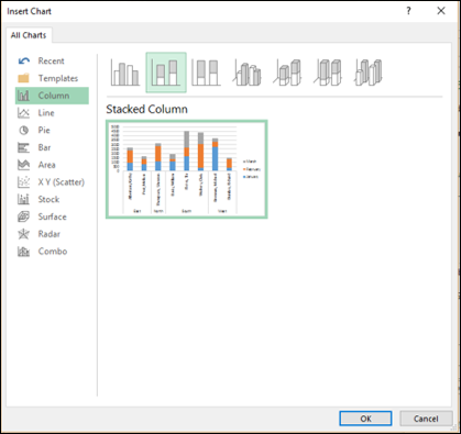
The stacked column chart is displayed.
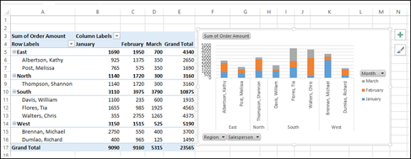
- Click on Month on the PivotChart.
- Filter to February and click OK.
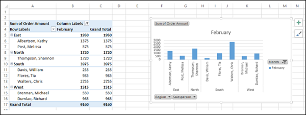
As you can observe, the PivotTable is also filtered as per the PivotChart.