- Excel Dashboards Tutorial
- Excel Dashboards - Home
- Introduction
- Excel Features Create Dashboards
- Conditional Formatting
- Excel Charts
- Interactive Controls
- Advanced Excel Charts
- Excel PivotTables
- Power PivotTables & PivotCharts
- Power View Reports
- Key Performance Indicators
- Build a Dashboard
- Examples
- Excel Dashboards Useful Resources
- Excel Dashboards - Quick Guide
- Excel Dashboards - Resources
- Excel Dashboards - Discussion
Excel Features to Create Dashboards
You can create a dashboard in Excel using various features that help you make data visualization prominent, which is the main characteristic of any dashboard. You can show data in tables with conditional formatting to highlight the good and bad results, you can summarize the data in charts and PivotTables, you can add interactive controls, and you can define and manage KPIs and so on.
In this chapter, you will get to know the most important Excel features that come handy when you are creating a dashboard. These features help you arrive at the dashboard elements that simplify complex data and provide visual impact on the current status or performance in real time.
Excel Tables
The most important component of any dashboard is its data. The data can be from a single source or multiple sources. The data might be limited or might span several rows.
Excel tables are well suited to get the data into the workbook, in which you want to create the dashboard. There are several ways to import data into Excel, by establishing connections to various sources. This makes it possible to refresh the data in your workbook whenever the source data gets updated.
You can name the Excel tables and use those names for referring your data in the dashboard. This would be easier than referring the range of data with cell references. These Excel tables are your working tables that contain the raw data.
You can arrive at a summary of the analysis of data and portray the same in an Excel table that can be included as a part of a dashboard.
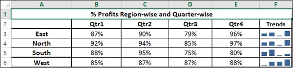
Sparklines
You can use Sparklines in your Excel tables to show trends over a period of time. Sparklines are mini charts that you can place in single cells. You can use line charts, column charts or win-loss charts to depict the trends based on your data.
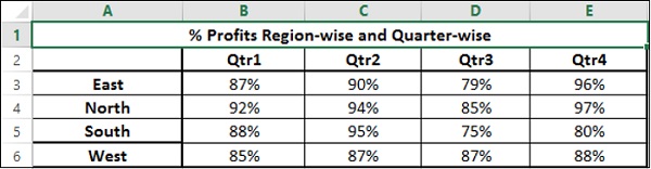
Conditional Formatting
Conditional formatting is a big asset to highlight data in the tables. You can define the rules by which you can vary color scales, data bars and/or icon sets. You can either use the Excel defined rules or create your own rules, based on the applicability to your data.
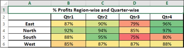
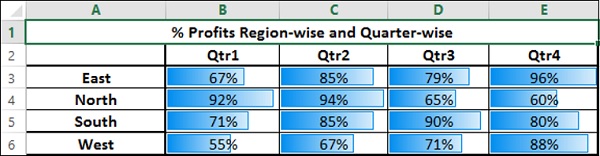
You will learn these conditional formatting techniques in the chapter ─ Conditional Formatting for Data Visualization.
Excel Charts
Excel charts are the most widely used data visualization components for dashboards. You can get the audience view the data patterns, comparisons and trends in data sets of any size strikingly adding color and styles.
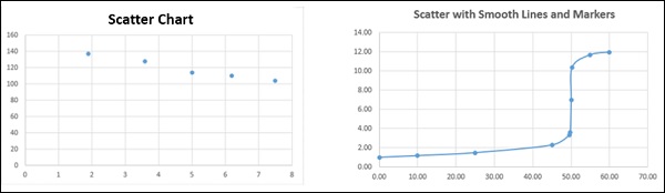
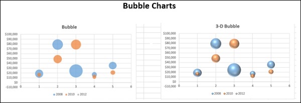
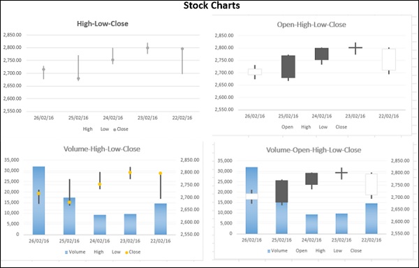
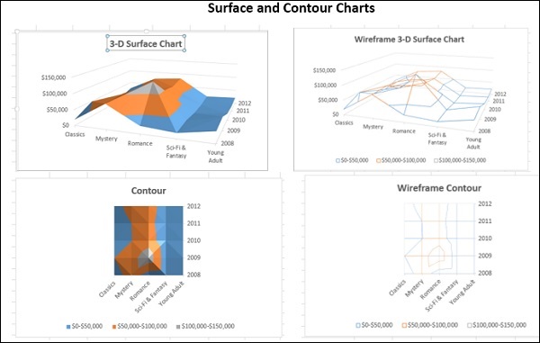
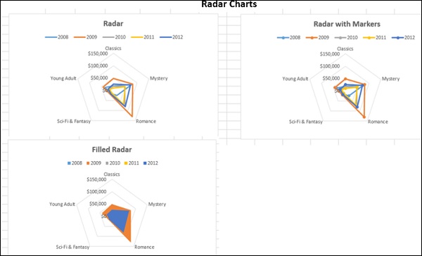
Excel has several built-in chart types such as line, bar, column, scatter, bubble, pie, doughnut, area, stock, surface and radar if you have Excel 2013.
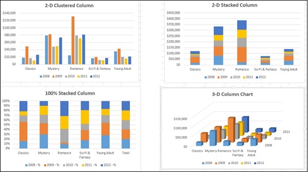
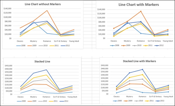
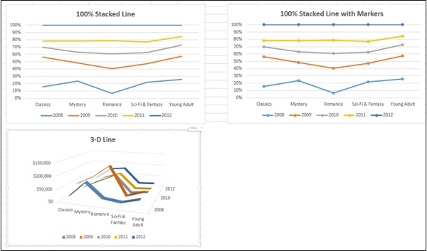
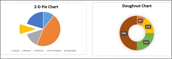
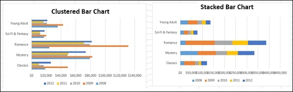
You will understand how to use these charts and the chart elements effectively in your dashboard in the chapter − Excel Charts for Dashboards.
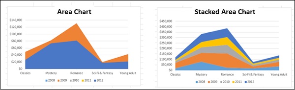
In addition to the above-mentioned chart types, there are other widely used chart types that come handy in representing certain data types. These are Waterfall Chart, Band Chart, Gantt chart, Thermometer Chart, Histogram, Pareto Chart, Funnel Chart, Box and Whisker Chart and Waffle Chart.
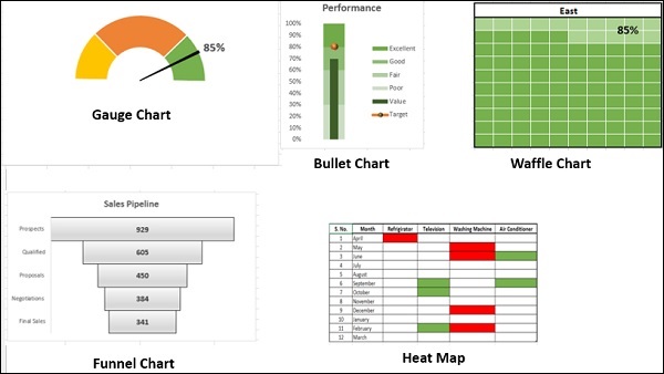
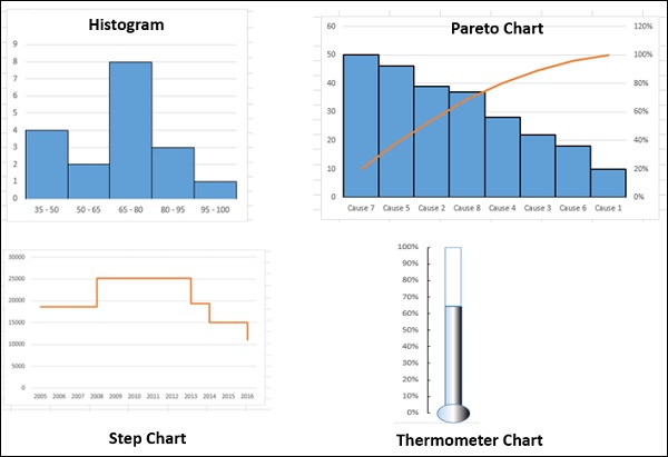
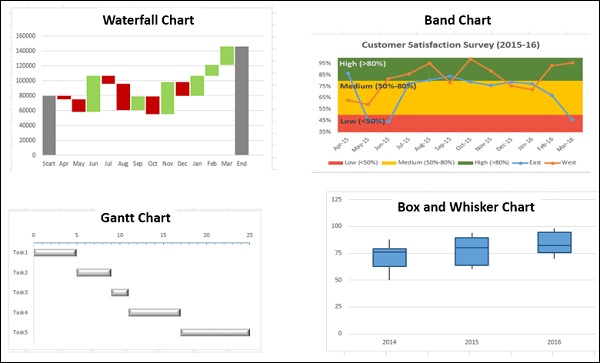
You will learn about these charts in the chapter − Advanced Excel Charts for Dashboards.
Excel Camera
Once you create charts, you need to place them in your dashboard. If you want to make your dashboard dynamic, with the data getting refreshed each time the source data changes, which is the case with most of the dashboards, you would like to provide an interface between the charts in your dashboard and the data at the backend. You can achieve this with the Camera feature of Excel.
Excel PivotTables
When you have large data sets and you would like to summarize the results dynamically showing various facets of the analysis results, Excel PivotTables come handy to include in your dashboard. You can use either the Excel tables or the more powerful data tables in the data model to create PivotTables.
The main differences between the two approaches are −
| Excel Tables | Data Tables |
|---|---|
| Data from only one table can be used to create PivotTable. | Data from more than one table can be used to create PivotTable, defining relationships between the tables. |
| When the tables increase in the no. of rows, the memory handling and storage will not be optimistic. | Can handle huge data sets with thousands of rows of data with memory optimization and decreased file size. |
If you try to create a PivotTable with more than one Excel table, you will be prompted to create relationship and the tables with the relationship get added to the data model.
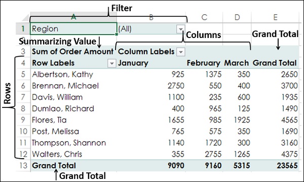
You will learn about PivotTables in the chapter − Excel PivotTables for Dashboards.
If you have data in the Data Model of your workbook, you can create Power PivotTables and Power PivotCharts that span data across multiple data tables.
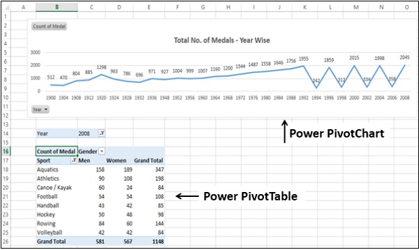
You will learn about these in the chapter − Excel Power PivotTables and Power PivotCharts for Dashboards.
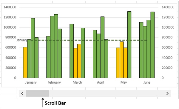
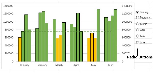
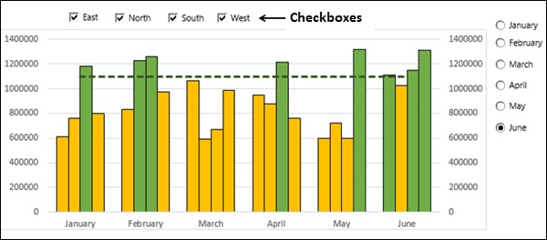
Dynamic Dashboard Elements with Interactive Controls
You can make your dashboard elements interactive with easy to use controls such as scrollbars, radio buttons, checkboxes and dynamic labels. You will learn more about these in the chapter − Interactive Controls in Excel Dashboards.
Scrollbars
Radio Buttons
Checkboxes
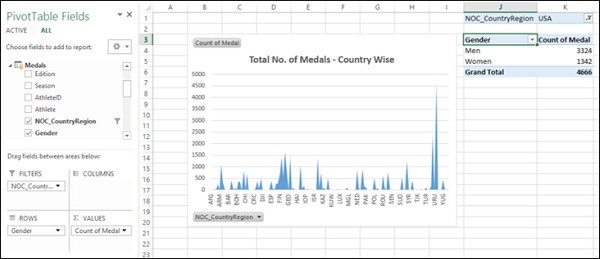
Excel Power PivotTables and Power PivotCharts
Excel Power PivotTables and Power PivotCharts are helpful to summarize data from multiple resources, by building a memory optimized Data Model in the workbook. The Data Tables in the Data Model can run through several thousands of dynamic data enabling summarization with less effort and time.
You will learn about the usage of Power PivotTables and Power PivotCharts in dashboards in the chapter - Excel Power PivotTables and Power PivotCharts for Dashboards.
Excel Data Model
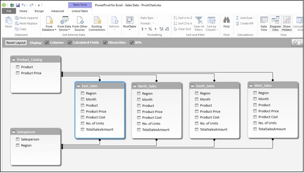
Excel Power PivotTable and Power PivotChart
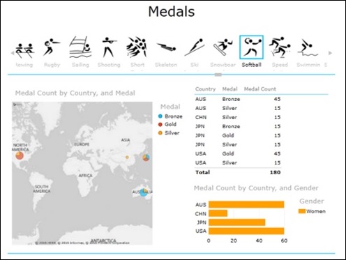
Excel Power View Reports
Excel Power View Reports provide interactive data visualization of large data sets bringing out the power of Data Model and interactive nature of dynamic Power View visualizations.
You will learn about how to use Power View as dashboard canvas in the chapter - Excel Power View Reports for Dashboards.
Power View Report
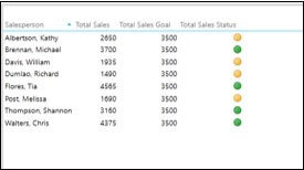
Key Performance Indicators (KPIs)
Key Performance Indicators (KPIs) are integral part of many dashboards. You can create and manage KPIs in Excel. You will learn about KPIs in the chapter − Key Performance Indicators in Excel Dashboards.
Key Performance Indicators