- Elasticsearch Tutorial
- Elasticsearch - Home
- Elasticsearch - Basic Concepts
- Elasticsearch - Installation
- Elasticsearch - Populate
- Migration between Versions
- Elasticsearch - API Conventions
- Elasticsearch - Document APIs
- Elasticsearch - Search APIs
- Elasticsearch - Aggregations
- Elasticsearch - Index APIs
- Elasticsearch - CAT APIs
- Elasticsearch - Cluster APIs
- Elasticsearch - Query DSL
- Elasticsearch - Mapping
- Elasticsearch - Analysis
- Elasticsearch - Modules
- Elasticsearch - Index Modules
- Elasticsearch - Ingest Node
- Elasticsearch - Managing Index Lifecycle
- Elasticsearch - SQL Access
- Elasticsearch - Monitoring
- Elasticsearch - Rollup Data
- Elasticsearch - Frozen Indices
- Elasticsearch - Testing
- Elasticsearch - Kibana Dashboard
- Elasticsearch - Filtering by Field
- Elasticsearch - Data Tables
- Elasticsearch - Region Maps
- Elasticsearch - Pie Charts
- Elasticsearch - Area and Bar Charts
- Elasticsearch - Time Series
- Elasticsearch - Tag Clouds
- Elasticsearch - Heat Maps
- Elasticsearch - Canvas
- Elasticsearch - Logs UI
- Elasticsearch Useful Resources
- Elasticsearch - Quick Guide
- Elasticsearch - Useful Resources
- Elasticsearch - Discussion
Elasticsearch - Pie Charts
Pie charts are one of the simplest and famous visualization tools. It represents the data as slices of a circle each coloured differently. The labels along with the percentage data values can be presented along with the circle. The circle can also take the shape of a donut.
Visualize
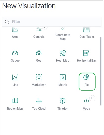
In Kibana Home screen, we find the option name Visualize which allows us to create visualization and aggregations from the indices stored in Elasticsearch. We choose to add a new visualization and select pie chart as the option shown below.
Choose the Metrics
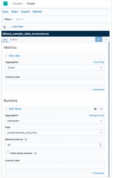
The next screen prompts us for choosing the metrics which will be used in creating the Pie Chart. Here we choose the count of base unit price as the metric and Bucket Aggregation as histogram. Also, the minimum interval is chosen as 20. So, the prices will be displayed as blocks of values with 20 as a range.
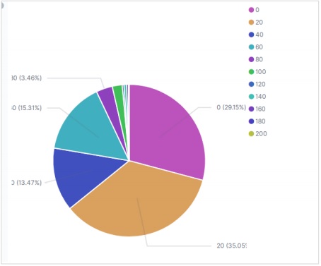
The result below shows the pie chart after we apply the selection. Please note the shades of the colour and their values mentioned in the label.
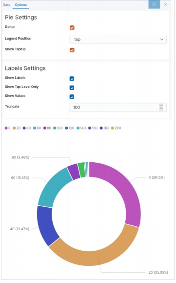
Pie Chart Options
On moving to the options tab under pie chart we can see various configuration options to change the look as well as the arrangement of data display in the pie chart. In the following example, the pie chart appears as donut and the labels appear at the top.