- Elasticsearch Tutorial
- Elasticsearch - Home
- Elasticsearch - Basic Concepts
- Elasticsearch - Installation
- Elasticsearch - Populate
- Migration between Versions
- Elasticsearch - API Conventions
- Elasticsearch - Document APIs
- Elasticsearch - Search APIs
- Elasticsearch - Aggregations
- Elasticsearch - Index APIs
- Elasticsearch - CAT APIs
- Elasticsearch - Cluster APIs
- Elasticsearch - Query DSL
- Elasticsearch - Mapping
- Elasticsearch - Analysis
- Elasticsearch - Modules
- Elasticsearch - Index Modules
- Elasticsearch - Ingest Node
- Elasticsearch - Managing Index Lifecycle
- Elasticsearch - SQL Access
- Elasticsearch - Monitoring
- Elasticsearch - Rollup Data
- Elasticsearch - Frozen Indices
- Elasticsearch - Testing
- Elasticsearch - Kibana Dashboard
- Elasticsearch - Filtering by Field
- Elasticsearch - Data Tables
- Elasticsearch - Region Maps
- Elasticsearch - Pie Charts
- Elasticsearch - Area and Bar Charts
- Elasticsearch - Time Series
- Elasticsearch - Tag Clouds
- Elasticsearch - Heat Maps
- Elasticsearch - Canvas
- Elasticsearch - Logs UI
- Elasticsearch Useful Resources
- Elasticsearch - Quick Guide
- Elasticsearch - Useful Resources
- Elasticsearch - Discussion
Elasticsearch - Heat Maps
Heat map is a type of visualization in which different shades of colour represent different areas in the graph. The values may be continuously varying and hence the colour r shades of a colour vary along with the values. They are very useful to represent both the continuously varying data as well as discrete data.
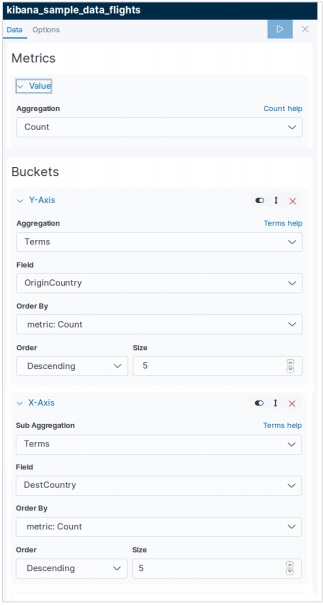
In this chapter we will use the data set named sample_data_flights to build a heatmap chart. In it we consider the variables named origin country and destination country of flights and take a count.
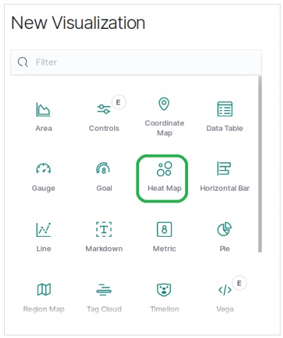
In Kibana Home screen, we find the option name Visualize which allows us to create visualization and aggregations from the indices stored in Elasticsearch. We choose to add a new visualization and select Heat Map as the option shown below &mimus;
Choose the Metrics
The next screen prompts us for choosing the metrics which will be used in creating the Heat Map Chart. Here we choose the count as the type of aggregation metric. Then for the buckets in Y-Axis, we choose Terms as the aggregation for the field OriginCountry. For the X-Axis, we choose the same aggregation but DestCountry as the field to be used. In both the cases, we choose the size of the bucket as 5.
On running the above shown configuration, we get the heat map chart generated as follows.
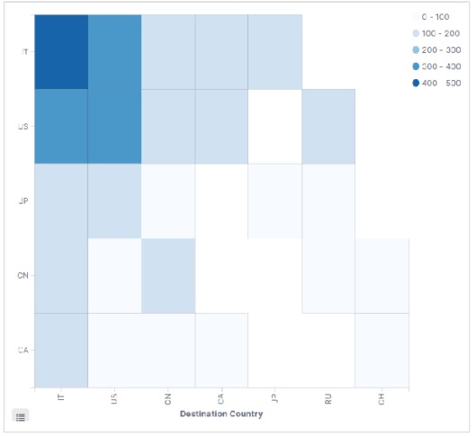
Note − You have to allow the date range as This Year so that the graph gathers data for a year to produce an effective heat map chart.