
- Drupal Basics Tutorial
- Drupal - Home
- Drupal - Overview
- Drupal - Installation
- Drupal - Architecture
- Drupal - Main Menu
- Drupal - Blocks & Regions
- Drupal - Themes & Layouts
- Drupal - Front Page
- Drupal - Static Pages
- Drupal - Create Blog
- Drupal - Create Articles
- Drupal - Create Pages
- Drupal - Create Content
- Drupal - Modify Content
- Drupal - Delete Content
- Drupal - Publish Content
- Drupal - Menu Management
- Drupal - Taxonomies
- Drupal - Comments
- Drupal - User Management
- Drupal - Optimization
- Drupal - Site Backup
- Drupal - Site Upgrade
- Drupal - Announcements
- Drupal Advanced
- Drupal - URL Alias
- Drupal - Site Search
- Drupal - Error Handling
- Drupal - Multilingual Content
- Drupal - Triggers & Actions
- Drupal - Social Networking
- Drupal - Internationalization
- Drupal - Extensions
- Drupal - Default Modules
- Drupal - Pane Module
- Drupal - Book Module
- Drupal - Aggregator Module
- Drupal - Contact Module
- Drupal - Form Module
- Drupal - Poll Module
- Drupal - Site Security
- Drupal E-Commerce
- Drupal - Setup Shopping Cart
- Drupal - Create Products
- Drupal - Create Categories
- Drupal - Setup Taxes
- Drupal - Setup Discounts
- Drupal - Receive Donations
- Drupal - Setup Shipping
- Drupal - Setup Payments
- Drupal - Invoice Generation
- Drupal - Email Notifications
- Drupal - Order History
- Drupal Useful Resources
- Drupal - Questions and Answers
- Drupal - Quick Guide
- Drupal - Useful Resources
- Drupal - Discussion
Drupal - Themes & Layouts
In this chapter, let us study about Themes and Layouts. Drupal will install Bartik theme as default theme during installation. You can select paid or free themes from Drupal official site. In general, layout is an arrangement of text and graphics. It is a good thought to choose a theme, keeping in mind what different layouts to use on your site.
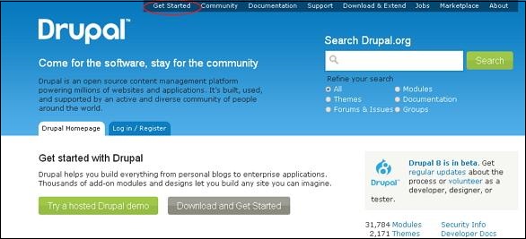
Step 1 − Go to Drupal official site and click Get Started.
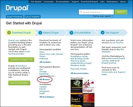
Step 2 − Click on All Themes as shown in the following screen.
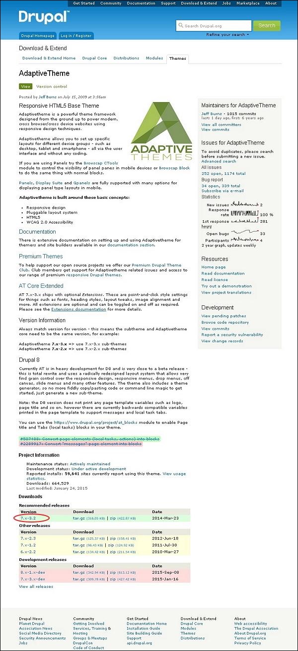
Step 3 − You will get a list of themes. Select theme of your choice (let us select Adaptive theme as it consists Layout & General Settings, which will be covered later in this chapter) and click Version as shown in the following screen.
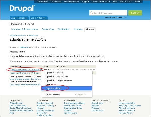
Step 4 − Next, right click Download file and copy the link address as shown in the following screen.
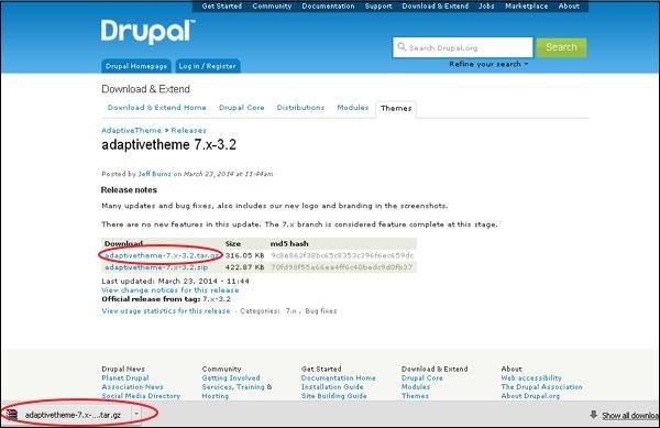
Step 5 − You can also download the theme directly by clicking on archive file and the module will be downloaded locally on your computer as shown in the following screen.
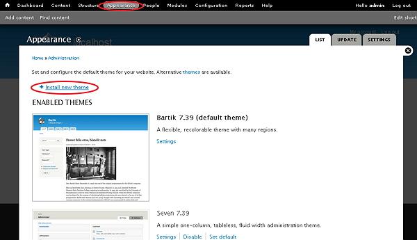
Step 6 − Go to Appearance and click Install new theme as shown in the following screen.
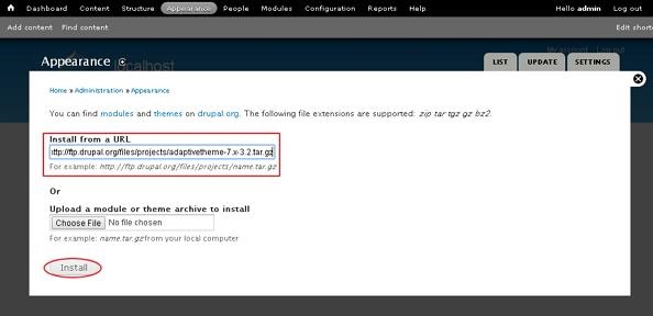
Step 7 − You can paste the link address you copied in step (4) and click the install button as shown in the following screen.
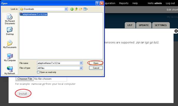
Step 8 − You can also upload the theme archive, instead of copying the link address, if you have downloaded it and click Install as shown in the following screen.
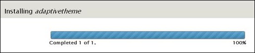
Step 9 − The following screen appears, wait until installation completes.
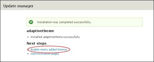
Step 10 − Next, click Enable newly added themes as shown in the following screen.
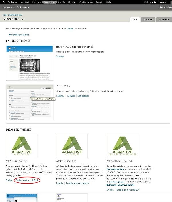
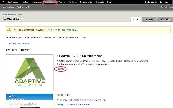
Step 11 − By default the themes are disabled. To enable them, click Enable and set default as shown in the following screen.
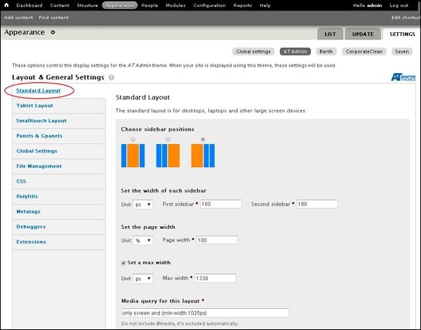
Step 12 − Click on Settings as shown in the following screen to set the appearance for your site.
Step 13 − The Layout & General Settings option pops up on the screen, in this Adaptive theme consists of Standard layout, Tablet Layout, Smalltouch layout and Panels & Gpanels. These options control the display settings for the current AT Admin theme that is already in use. When your site displays the theme, these settings will be used. Now, let us discuss these layouts one by one.
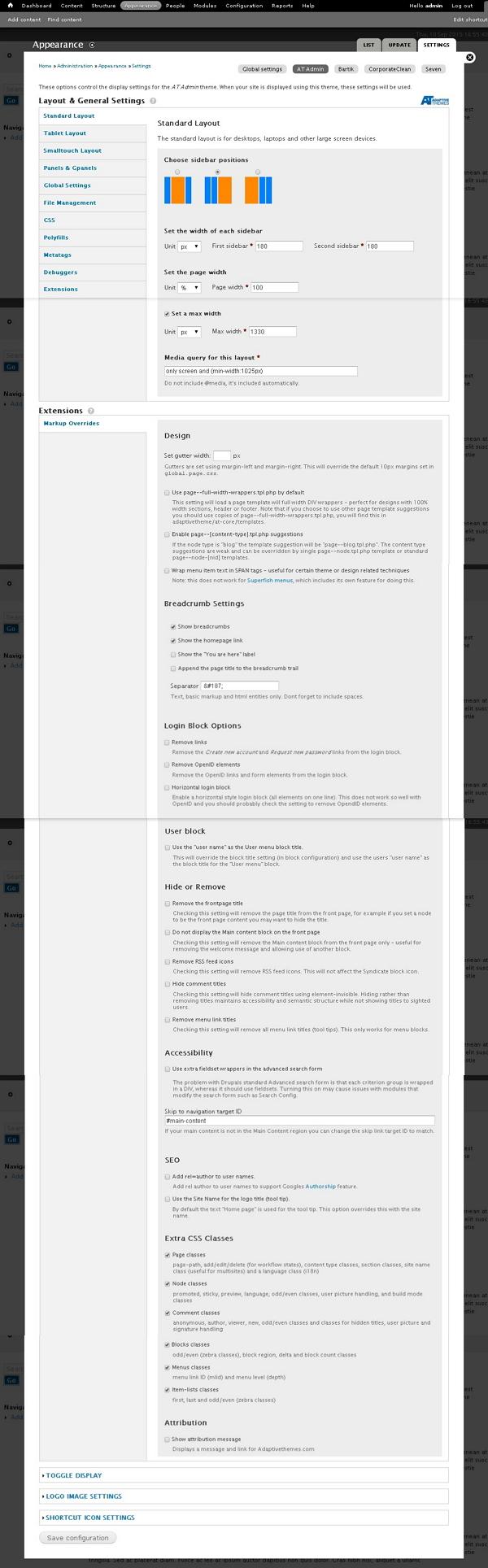
Step 14 − In Standard layout you can choose layout for desktops, laptops and other large screen devices.
Choose sidebar positions − You can choose sidebar position by clicking on radio button.
Set the width of each sidebar − You can set width of first sidebar and second sidebar and unit in % or px or em.
Set the page width − You can set width of the page.
Set a max width −You can check or uncheck to set maximum width.
Media query for this layout − Media query defines different style rules for different media devices and by default for this layout will be 1025px.
Step 15 − Next, click Tablet Layout as shown in the following screen. Tablet devices will have two orientations Landscape and Portrait. You can configure a different layout for each orientation.
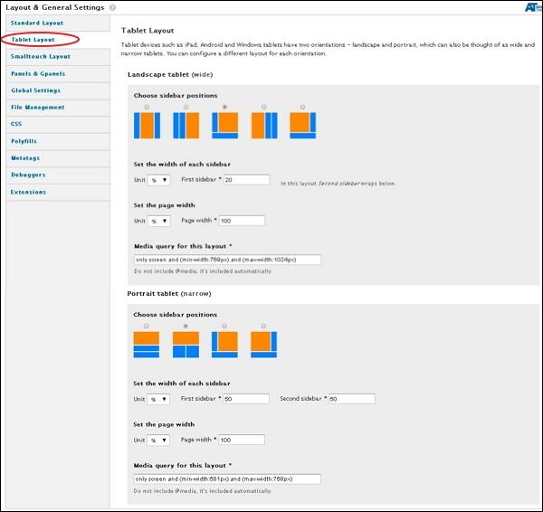
Under Landscape tablet and Portrait tablet you can choose sidebar position, width of each sidebar and page width. Media query for Landscape tablet will be min-width:769px and max-width:1024px. For Portrait tablet it will be min-width:581px and max-width:768px
Step 16 − Now, click Smalltouch Layout as shown in the following screen. Smalltouch layout will also have two orientations Landscape and Portrait. You can configure a different layout for each orientation.
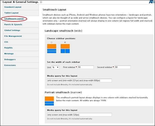
In Landscape Smalltouch you can choose sidebar position and set width. The Portrait Smalltouch always displays in one column with sidebars stacked horizontally below the main content. Media query for Landscape Smalltouch will be min-width:321px and max-width:580px and for Portrait Smalltouch it will be max-width:320px.
Step 17 − Next, click Panels & Gpanels as shown in the following screen. Adaptive theme supports responsive Panels and Gpanel layouts. To use this capability, you can use the Panels module, Display Suite (with Panels) or Adaptive themes native Gpanels layouts.
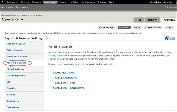
You can select options for each device range and layout their type. Let us see one by one.
Under Standard layout you can select the layouts you want to use when the site is being viewed in standard layout. By clicking on TWO, THREE, FOUR, FIVE, SIX or INSET, you can select the columns arrangement as shown in the following screen.
.jpg)
Follow the same step for TABLET LANDSCAPE, TABLET PORTRAIT and SMALLTOUCH LANDSCAPE layouts.
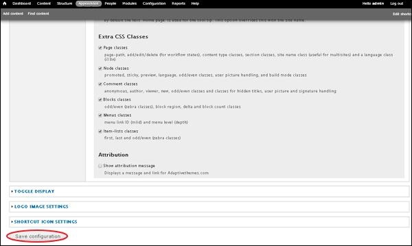
Step 18 − Once done with all your configurations, click Save configurations as shown in the following screen.