- DC.js Tutorial
- DC.js - Home
- DC.js - Introduction
- DC.js - Installation
- DC.js - Concepts
- Introduction to Crossfilter
- Introduction to D3.js
- DC.js - Mixins
- DC.js - baseMixin
- DC.js - capMixin
- DC.js - colorMixin
- DC.js - marginMixin
- DC.js - coordinateGridMixin
- DC.js - Pie Chart
- DC.js - Line Chart
- DC.js - Bar Chart
- DC.js - Composite Chart
- DC.js - Series Chart
- DC.js - Scatter Plot
- DC.js - Bubble Chart
- DC.js - Heat Map
- DC.js - Data Count
- DC.js - Data Table
- DC.js - Data Grid
- DC.js - Legend
- DC.js - Dashboard Working Example
- DC.js Useful Resources
- DC.js - Quick Guide
- DC.js - Useful Resources
- DC.js - Discussion
DC.js - Composite Chart
Composite chart is a special type of chart provided by DC.js. It provides an option to render multiple charts in the same coordinate grid. Composite chart enables advanced chart visualization options with a minimum line of code.
Composite Chart Methods
Before moving on to draw a composite chart, we need to understand the dc.compositeChart class and its methods. The dc.compositeChart uses mixins to get the basic functionality of drawing a chart. The mixins used by the dc.compositeChart are as follows −
- dc.baseMixin
- dc.marginMixin
- dc.colorMixin
- dc.coordinateGridMixin
The complete class diagram of the dc.barChart is as follows −
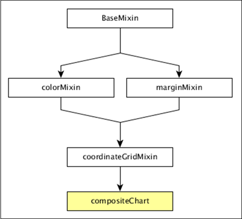
The dc.compositeChart gets all the methods of the above-specified mixins. It has its own method to draw the composite chart, which is explained below −
compose( [subChartArray])
Set the collection of charts to be rendered in the same coordinate grid chart.
chart.compose([
   dc.lineChart(chart)
   dc.barChart(chart)
]);
children()
Gets all the charts composed in the same coordinate grid.
childOptions( [childOptions])
Gets or sets the chart options for all the child charts composed in the same coordinate grid.
shareTitle( [shareTitle])
Gets or sets the shared title of the chart. If set, it will be shared with all the children charts composed in the same coordinate grid.
shareColors( [shareColors])
Similar to the shareTitle() function, except it shares the colors instead of the title.
rightY( [yScale])
Gets or sets the y-scale for the right axis of the composite chart.
rightYAxis( [rightYAxis])
Gets or sets the right y-axis of the composite chart.
rightYAxisLabel( rightYAxisLabel[??])
Gets or sets the right y-axis label.
alignYAxes( [alignYAxes])
Gets or sets the alignment between the left and right y-axis.
useRightAxisGridLines( [useRightAxisGridLines])
Gets or sets whether to draw gridlines from the right y-axis of the composite chart. The default behavior is to draw from the left y-axis.
Draw a Composite Chart
Let us draw a composite chart using DC.js. To do this, we should follow the steps given below −
Step 1: Define a variable
Let us define a chart variable as shown below −
var chart = dc.compositeChart('#compoiste');
Here, the dc.compositeChart function is mapped with a container having composite as its id.
Step 2: Read the data
Read data from the people.csv file −
d3.csv("data/people.csv", function(errors, people) {

}
If data is not present, then it returns an error. We will use the same people.csv file. The sample data file is as follows −
id,name,gender,DOB,MaritalStatus,CreditCardType
1,Damaris,Female,1973-02-18,false,visa-electron
2,Barbe,Female,1969-04-10,true,americanexpress
3,Belia,Female,1960-04-16,false,maestro
4,Leoline,Female,1995-01-19,true,bankcard
5,Valentine,Female,1992-04-16,false,
6,Rosanne,Female,1985-01-05,true,bankcard
7,Shalna,Female,1956-11-01,false,jcb
8,Mordy,Male,1990-03-27,true,china-unionpay

.............
.............
..............
Step 3: Map the data
Now, map the data as shown below −
var ndx = crossfilter();

ndx.add(people.map(function(data) {
   return {
      age: ~~((Date.now() - new Date(data.DOB)) / (31557600000)),
      male: data.gender == 'Male' ? 1 : 0,
      female: data.gender == 'Male' ? 0 : 1
   };
}));
Here, we assigned the age from the Crossfilter data. The ~~ is a double NOT bitwise operator. It is used as a faster substitute.
Now, apply the dimension age and group the gender data using the coding given below −
var dim  = ndx.dimension(dc.pluck('age')),

grp1 = dim.group().reduceSum(dc.pluck('male')),
grp2 = dim.group().reduceSum(dc.pluck('female'));
Step 4: Generate a chart
Now, generate a composite chart using the coding given below −
composite
   .width(768)
   .height(480)
   .x(d3.scale.linear().domain([15,70]))
   .yAxisLabel("Count")
   .xAxisLabel("Age")
   .legend(dc.legend().x(80).y(20).itemHeight(13).gap(5))
   .renderHorizontalGridLines(true)
   .compose ([
      dc.lineChart(composite)
         .dimension(dim)
         .colors('red')
         .group(grp1, "Male")
         .dashStyle([2,2]),
      dc.lineChart(composite)
         .dimension(dim)
         .colors('blue')
         .group(grp2, "Female")
         .dashStyle([5,5])
   ])

.brushOn(false)
.render();
Here,
Chart width is 768 and height is 480.
The d3.scale.linear function is used to construct a new linear scale with the specified domain range [15, 70].
We assign a x-axis label as age and y-axis label as count.
Next, render horizontal grid lines as true.
Compose the line chart colors value – red for male gender and blue for female.
Finally, we set the brushOn value to false and render the chart.
Step 5: Working example
The complete code is as follows. Create a web page composite.html and add the following changes to it.
<html>
   <head>
      <title>DC composite chart Sample</title>
      <link rel = "stylesheet" type = "text/css" href = "css/bootstrap.css">
      <link rel = "stylesheet" type = "text/css" href = "css/dc.css"/>

      <script src = "js/d3.js"></script>
      <script src = "js/crossfilter.js"></script>
      <script src = "js/dc.js"></script>
   </head>

   <body>
      <div>
         <div id = "composite"></div>
      </div>

      <script type = "text/javascript">
         var composite = dc.compositeChart("#composite");

         d3.csv("data/people.csv", function(errors, people) {
            var ndx = crossfilter();

            ndx.add(people.map(function(data) {
               return {
                  age: ~~((Date.now() - new Date(data.DOB)) / (31557600000)),
                  male: data.gender == 'Male' ? 1 : 0,
                  female: data.gender == 'Male' ? 0 : 1
               };
            }));

            var dim  = ndx.dimension(dc.pluck('age')),

            grp1 = dim.group().reduceSum(dc.pluck('male')),
            grp2 = dim.group().reduceSum(dc.pluck('female'));

            composite
               .width(768)
               .height(480)
               .x(d3.scale.linear().domain([15,70]))
               .yAxisLabel("Count")
               .xAxisLabel("Age")
               .legend(dc.legend().x(80).y(20).itemHeight(13).gap(5))
               .renderHorizontalGridLines(true)
               .compose ([
                  dc.lineChart(composite)
                  .dimension(dim)
                  .colors('red')
                  .group(grp1, "Male")
                  .dashStyle([2,2]),
                  dc.lineChart(composite)
                     .dimension(dim)
                     .colors('blue')
                     .group(grp2, "Female")
                     .dashStyle([5,5])
               ])
               .brushOn(false)
               .render();
         });
      </script>
   </body>
</html>
Now, request the browser and we will see the following response.