- Angular7 Tutorial
- Angular7 - Home
- Angular7 - Overview
- Angular7 - Environment Setup
- Angular7 - Project Setup
- Angular7 - Components
- Angular7 - Modules
- Angular7 - Data Binding
- Angular7 - Event Binding
- Angular7 - Templates
- Angular7 - Directives
- Angular7 - Pipes
- Angular7 - Routing
- Angular7 - Services
- Angular7 - Http Client
- Angular7 - CLI Prompts
- Angular7 - Forms
- Materials/CDK-Virtual Scrolling
- Angular7 - Materials/CDK-Drag & Drop
- Angular7 - Animations
- Angular7 - Materials
- Testing & Building Angular7 Project
- Angular7 Useful Resources
- Angular7 - Quick Guide
- Angular7 - Useful Resources
- Angular7 - Discussion
Angular7 - Materials
Materials offer a lot of built-in modules for your project. Features such as autocomplete, datepicker, slider, menus, grids, and toolbar are available for use with materials in Angular 7.
To use materials, we need to import the package. Angular 2 also has all the above features but they are available as part of the @angular/core module. From Angular 4, Materials module has been made available with a separate module @angular/materials. This helps the user to import only the required materials in their project.
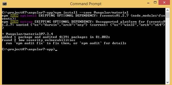
To start using materials, you need to install two packages: materials and cdk. Material components depend on the animation module for advanced features. Hence you need the animation package for the same, @angular/animations. The package has already been updated in the previous chapter. We have already installed @angular/cdk packages in previous chapters for virtual and drag drop module.
Following is the command to add materials to your project −
npm install --save @angular/material
Let us now see the package.json. @angular/material and @angular/cdk are installed.
{
   "name": "angular7-app",
   "version": "0.0.0",
   "scripts": {
      "ng": "ng",
      "start": "ng serve",
      "build": "ng build",
      "test": "ng test",
      "lint": "ng lint",
      "e2e": "ng e2e"
   },
   "private": true,
   "dependencies": {
      "@angular/animations": "~7.2.0",
      "@angular/cdk": "^7.3.4",
      "@angular/common": "~7.2.0",
      "@angular/compiler": "~7.2.0",
      "@angular/core": "~7.2.0",
      "@angular/forms": "~7.2.0",
      "@angular/material": "^7.3.4",
      "@angular/platform-browser": "~7.2.0",
      "@angular/platform-browser-dynamic": "~7.2.0",
      "@angular/router": "~7.2.0",
      "core-js": "^2.5.4",
      "rxjs": "~6.3.3",
      "tslib": "^1.9.0",
      "zone.js": "~0.8.26"
   },
   "devDependencies": {
      "@angular-devkit/build-angular": "~0.13.0",
      "@angular/cli": "~7.3.2",
      "@angular/compiler-cli": "~7.2.0",
      "@angular/language-service": "~7.2.0",
      "@types/node": "~8.9.4",
      "@types/jasmine": "~2.8.8",
      "@types/jasminewd2": "~2.0.3",
      "codelyzer": "~4.5.0",
      "jasmine-core": "~2.99.1",
      "jasmine-spec-reporter": "~4.2.1",
      "karma": "~3.1.1",
      "karma-chrome-launcher": "~2.2.0",
      "karma-coverage-istanbul-reporter": "~2.0.1",
      "karma-jasmine": "~1.1.2",
      "karma-jasmine-html-reporter": "^0.2.2",
      "protractor": "~5.4.0",
      "ts-node": "~7.0.0",
      "tslint": "~5.11.0",
      "typescript": "~3.2.2"
   }
}
We have highlighted the packages that are installed to work with materials.
We will now import the modules in the parent module - app.module.ts as shown below.
import { BrowserModule } from '@angular/platform-browser';
import { NgModule } from '@angular/core';
import { AppRoutingModule , RoutingComponent} from './app-routing.module';
import { AppComponent } from './app.component';
import { NewCmpComponent } from './new-cmp/new-cmp.component';
import { ChangeTextDirective } from './change-text.directive';
import { SqrtPipe } from './app.sqrt';
import { MyserviceService } from './myservice.service';
import { HttpClientModule } from '@angular/common/http';
import { ScrollDispatchModule } from '@angular/cdk/scrolling';
import { DragDropModule } from '@angular/cdk/drag-drop';
import { ReactiveFormsModule } from '@angular/forms';
import { BrowserAnimationsModule } from '@angular/platform-browser/animations';
import { MatButtonModule, MatMenuModule, MatSidenavModule } from '@angular/material';

@NgModule({
   declarations: [
      SqrtPipe,
      AppComponent,
      NewCmpComponent,
      ChangeTextDirective,
      RoutingComponent
   ],
   imports: [
      BrowserModule,
      AppRoutingModule,
      HttpClientModule,
      ScrollDispatchModule,
      DragDropModule,
      ReactiveFormsModule,
      BrowserAnimationsModule,
      MatButtonModule,
      MatMenuModule,
      MatSidenavModule
   ],
   providers: [MyserviceService],
   bootstrap: [AppComponent]
})
export class AppModule { }
In the above file, we have imported the following modules from @angular/materials.
import { MatButtonModule, MatMenuModule, MatSidenavModule } from '@angular/material';
And the same is used in the imports array as shown below −
imports: [
   BrowserModule,
   AppRoutingModule,
   HttpClientModule,
   ScrollDispatchModule,
   DragDropModule,
   ReactiveFormsModule,
   BrowserAnimationsModule,
   MatButtonModule,
   MatMenuModule,
   MatSidenavModule
],
The app.component.ts is as shown below −
import { Component } from '@angular/core';
@Component({
   selector: 'app-root',
   templateUrl: './app.component.html',
   styleUrls: ['./app.component.css']
})
export class AppComponent {
   constructor() {}
}
Let us now add the material-css support in styles.css.
@import "~@angular/material/prebuilt-themes/indigo-pink.css";
Let us now add materials inside app.component.html
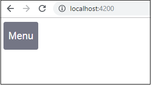
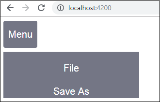
Menu
To add menu, <mat-menu></mat-menu> is used. The file and Save As items are added to the button under mat-menu. There is a main button added Menu. The reference of the same is given the <mat-menu> by using [matMenuTriggerFor]="menu" and using the menu with # in<mat-menu>.
app.component.html
<button mat-button [matMenuTriggerFor] = "menu">Menu</button>
<mat-menu #menu = "matMenu">
   <button mat-menu-item> File </button>
   <button mat-menu-item> Save As </button>
</mat-menu>
The below image is displayed in the browser −
Clicking on Menu will display the items inside it −
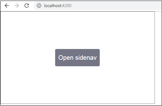
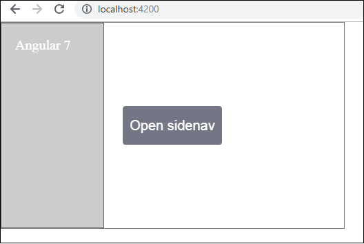
SideNav
To add sidenav, we need <mat-sidenav-container></mat-sidenav-container>. <mat-sidenav></mat-sidenav> is added as a child to the container. There is another div added, which triggers the sidenav by using (click)="sidenav.open()".
app.component.html
<mat-sidenav-container class="example-container" fullscreen>
   <mat-sidenav #sidenav class = "example-sidenav">
      Angular 7
   </mat-sidenav>
   <div class = "example-sidenav-content">
      <button type = "button" mat-button (click) = "sidenav.open()">
         Open sidenav
      </button>
   </div>
</mat-sidenav-container>
app.component.css
.example-container {
   width: 500px;
   height: 300px;
   border: 1px solid rgba(0, 0, 0, 0.5);
}
.example-sidenav {
   padding: 20px;
   width: 150px;
   font-size: 20px;
   border: 1px solid rgba(0, 0, 0, 0.5);
   background-color: #ccc;
   color:white;
}
Following is the display of menu and sidenav in the browser −
Following panel opens up on the left side if we click on Open Sidenav −
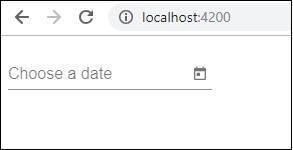
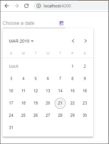
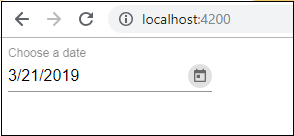
Datepicker
Let us now add a datepicker using materials. To add a datepicker, we need to import the modules required to show the datepicker.
In app.module.ts, we have imported the following module as shown below for datepicker −
import { BrowserModule } from '@angular/platform-browser';
import { NgModule } from '@angular/core';
import { AppRoutingModule , RoutingComponent} from './app-routing.module';
import { AppComponent } from './app.component';
import { NewCmpComponent } from './new-cmp/new-cmp.component';
import { ChangeTextDirective } from './change-text.directive';
import { SqrtPipe } from './app.sqrt';
import { MyserviceService } from './myservice.service';
import { HttpClientModule } from '@angular/common/http';
import { ScrollDispatchModule } from '@angular/cdk/scrolling';
import { DragDropModule } from '@angular/cdk/drag-drop';
import { ReactiveFormsModule } from '@angular/forms';
import { BrowserAnimationsModule } from '@angular/platform-browser/animations';
import { MatDatepickerModule, MatInputModule, MatNativeDateModule } from '@angular/material';

@NgModule({
   declarations: [
      SqrtPipe,
      AppComponent,
      NewCmpComponent,
      ChangeTextDirective,
      RoutingComponent
   ],
   imports: [
      BrowserModule,
      AppRoutingModule,
      HttpClientModule,
      ScrollDispatchModule,
      DragDropModule,
      ReactiveFormsModule,
      BrowserAnimationsModule,
      MatDatepickerModule,
      MatInputModule,
      MatNativeDateModule
   ],
   providers: [MyserviceService],
   bootstrap: [AppComponent]
})
export class AppModule { }
Here, we have imported modules such as MatDatepickerModule, MatInputModule, and MatNativeDateModule.
Now, the app.component.ts is as shown below −
import { Component } from '@angular/core';
@Component({
   selector: 'app-root',
   templateUrl: './app.component.html', s
   tyleUrls: ['./app.component.css']
})
export class AppComponent {
   constructor() {}
}
The app.component.html is as shown below −
<mat-form-field>
   <input matInput [matDatepicker] = "picker" placeholder = "Choose a date">
   <mat-datepicker-toggle matSuffix [for] = "picker"></mat-datepicker-toggle>
   <mat-datepicker #picker></mat-datepicker>
</mat-form-field>
Global css added in style.css −
/* You can add global styles to this file, and also
import other style files */
@import '~@angular/material/prebuilt-themes/deeppurple-amber.css';
body {
   font-family: Roboto, Arial, sans-serif;
   margin: 10;
}
.basic-container {
   padding: 30px;
}
.version-info {
   font-size: 8pt;
   float: right;
}
The datepicker is displayed in the browser as shown below −