- Angular 6 Tutorial
- Angular 6 - Home
- Angular 6 - Overview
- Angular 6 - Environment Setup
- Angular 6 - Project Setup
- Angular 6 - Components
- Angular 6 - Module
- Angular 6 - Data Binding
- Angular 6 - Event Binding
- Angular 6 - Templates
- Angular 6 - Directives
- Angular 6 - Pipes
- Angular 6 - Routing
- Angular 6 - Services
- Angular 6 - Http Service
- Angular 6 - Http Client
- Angular 6 - Forms
- Angular 6 - Animations
- Angular 6 - Materials
- Angular 6 - CLI
- Angular 6 Useful Resources
- Angular 6 - Quick Guide
- Angular 6 - Useful Resources
- Angular 6 - Discussion
Angular 6 - Animations
Animations add a lot of interaction between the html elements. Animation was also available with Angular2. The difference with Angular 6 is that animation is no more a part of the @angular/core library, but is a separate package that needs to be imported in app.module.ts.
To start with, we need to import the library as follows −
import { BrowserAnimationsModule } from '@angular/platform-browser/animations';
The BrowserAnimationsModule needs to be added to the import array in app.module.ts as shown below −
app.module.ts
import { BrowserModule } from '@angular/platform-browser';
import { NgModule } from '@angular/core';
import { BrowserAnimationsModule } from '@angular/platform-browser/animations';
import { AppComponent } from './app.component';
@NgModule({
   declarations: [
      AppComponent
   ],
   imports: [
      BrowserModule,
      BrowserAnimationsModule
   ],
   providers: [],
   bootstrap: [AppComponent]
})
export class AppModule { }
In app.component.html, we have added the html elements, which are to be animated.
<div>
   <button (click) = "animate()">Click Me</button>
   <div [@myanimation] = "state" class = "rotate">
      <img src = "assets/images/img.png" width = "100" height = "100">
   </div>
</div>
For the main div, we have added a button and a div with an image. There is a click event for which the animate function is called. And for the div, the @myanimation directive is added and given the value as state.
Let us now see the app.component.ts where the animation is defined.
import { Component } from '@angular/core';
import { trigger, state, style, transition, animate } from '@angular/animations';
@Component({
   selector: 'app-root',
   templateUrl: './app.component.html',
   styleUrls: ['./app.component.css'],
   styles:[`
      div{
         margin: 0 auto;
         text-align: center;
         width:200px;
      }
      .rotate{
         width:100px;
         height:100px;
         border:solid 1px red;
      }
   `],
   animations: [
      trigger('myanimation',[
         state('smaller',style({
            transform : 'translateY(100px)'
         })),
         state('larger',style({
            transform : 'translateY(0px)'
         })),
         transition('smaller <=> larger',animate('300ms ease-in'))
      ])
   ]
})
export class AppComponent {
   state: string = "smaller";
   animate() {
      this.state= this.state == 'larger' ? 'smaller' : 'larger';
   }
}
We have to import the animation function that is to be used in the .ts file as shown above.
import { trigger, state, style, transition, animate } from '@angular/animations';
Here we have imported trigger, state, style, transition, and animate from @angular/animations.
Now, we will add the animations property to the @Component () decorator −
animations: [
   trigger('myanimation',[
      state('smaller',style({
         transform : 'translateY(100px)'
      })),
      state('larger',style({
         transform : 'translateY(0px)'
      })),
      transition('smaller <=> larger',animate('300ms ease-in'))
   ])
]
Trigger defines the start of the animation. The first param to it is the name of the animation to be given to the html tag to which the animation needs to be applied. The second param are the functions we have imported - state, transition, etc.
The state function involves the animation steps, which the element will transition between. Right now we have defined two states, smaller and larger. For smaller state, we have given the style transform:translateY(100px) and transform:translateY(100px).
Transition function adds animation to the html element. The first argument takes the states, i.e., start and end; the second argument accepts the animate function. The animate function allows you to define the length, delay, and easing of a transition.
Let us now see the .html file to see how the transition function works
<div>
   <button (click) = "animate()">Click Me</button>
   <div [@myanimation] = "state" class="rotate">
      <img src = "assets/images/img.png" width = "100" height = "100">
   </div>
</div>
There is a style property added in the @component directive, which centrally aligns the div. Let us consider the following example to understand the same −
styles:[`
   div{
      margin: 0 auto;
      text-align: center;
      width:200px;
   }
   .rotate{
      width:100px;
      height:100px;
      border:solid 1px red;
   }
`],
Here, a special character [``] is used to add styles to the html element, if any. For the div, we have given the animation name defined in the app.component.ts file.
On the click of a button it calls the animate function, which is defined in the app.component.ts file as follows −
export class AppComponent {
state: string = "smaller";
animate() {
this.state= this.state == �larger�? 'smaller' : 'larger';
}
}
The state variable is defined and is given the default value as smaller. The animate function changes the state on click. If the state is larger, it will convert to smaller; and if smaller, it will convert to larger.
This is how the output in the browser (http://localhost:4200/) will look like −
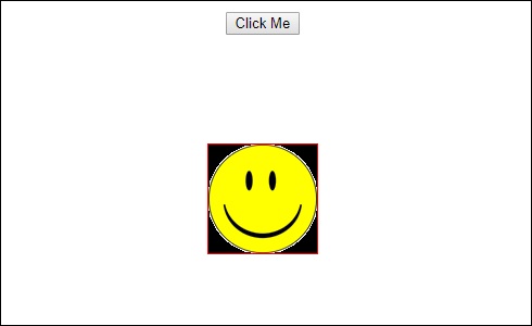
Upon clicking the Click Me button, the position of the image is changed as shown in the following screenshot −
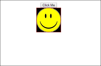
The transform function is applied in the y direction, which is changed from 0 to 100px when the Click Me button is clicked. The image is stored in the assets/images folder.